Reem Email Design
The Challenge
Delivering 2.8 million square feet of retail (2m square feet of leasable space) Reem Mall will comprise around 450 stores, including 85 F&B outlets and a range of family-focused entertainment offerings. Positioned on Reem Island – right in the heart of new Abu Dhabi.
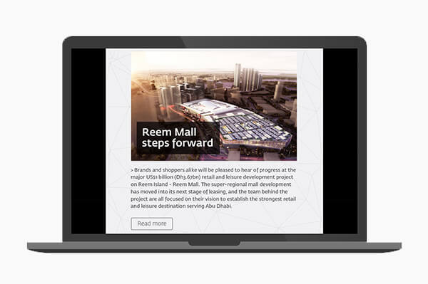
It was my job to design a reusable email template for Reem Mall. The design needs to be successful at informing users of news and developments at Reem Mall and increase customer loyalty and awareness. The email must be readable on all devices – tablets, phones and desktops, as well as i0S and Android.
Other considerations:
- They wanted me to look at introducing some more unique features to the pages, to ensure it looks less like a template, and more unique to Reem Mall.
- They wanted me to introduce any other “bells and whistles” that improve the user experience.
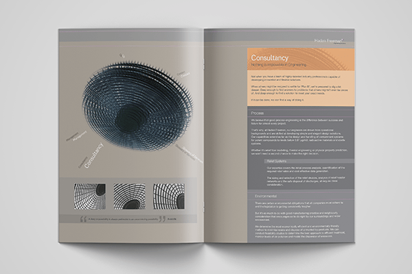
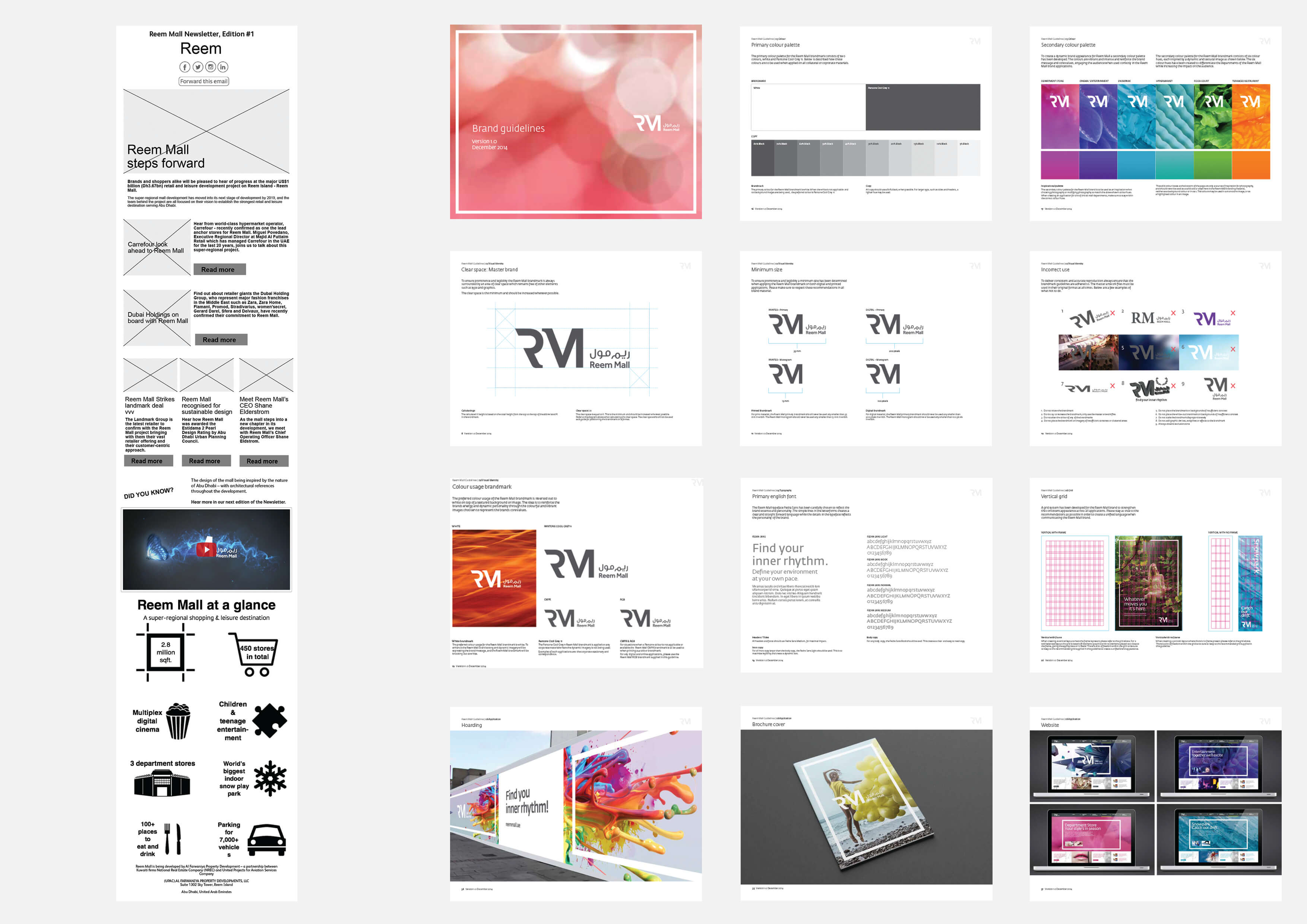
- I had to adhere to brand guiltiness and use the Reem Mall font (Fedra) wherever possible using the light and heavier versions of it. Brand guidelines were provided, some example pages shown below.
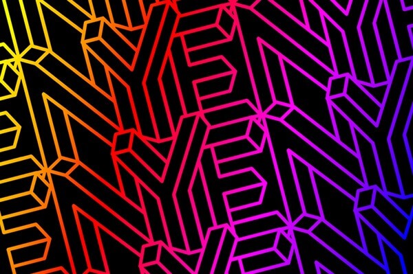
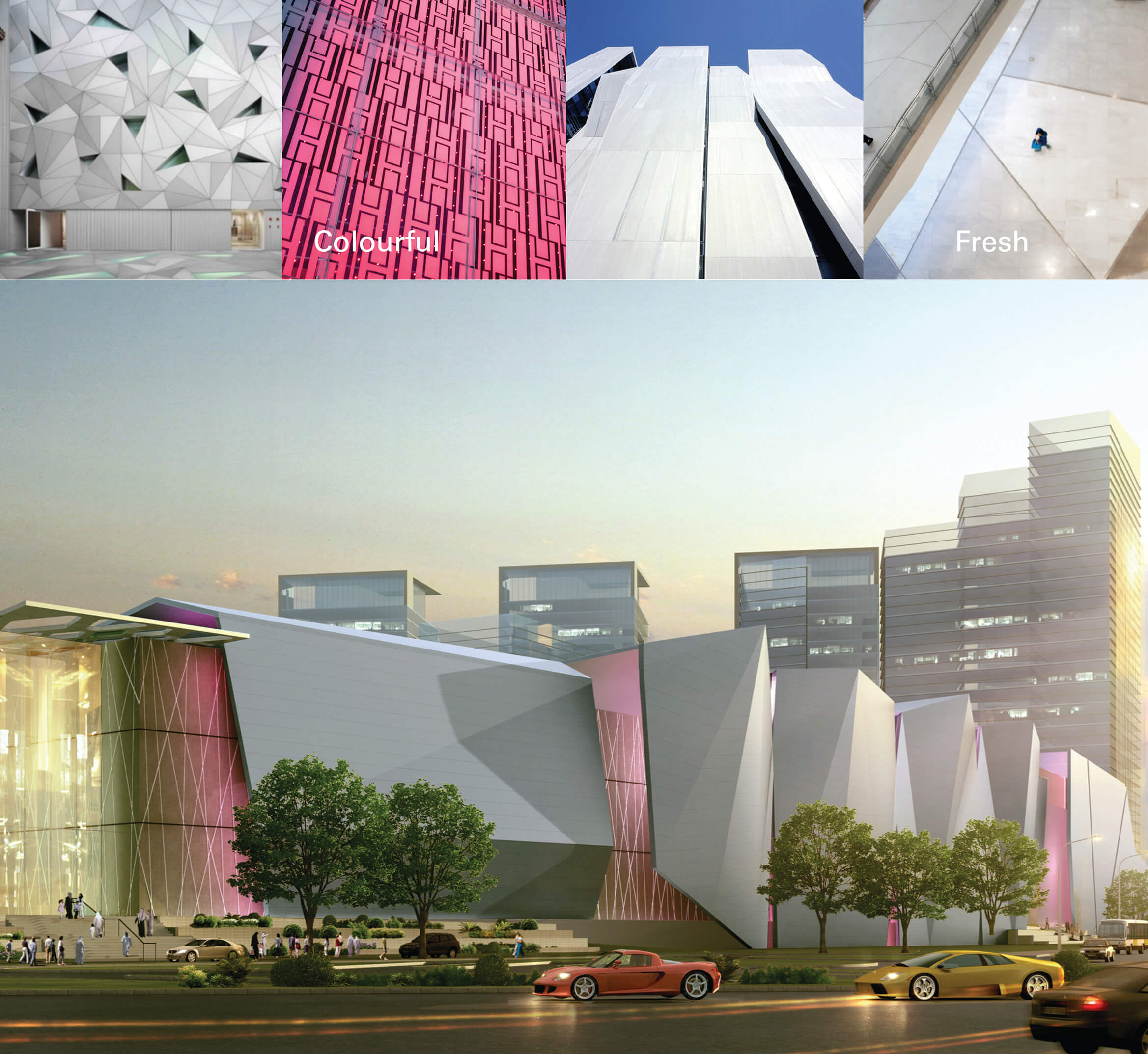
- They suggested that I think about incorporating line-art patterns which can be found in the architect’s concept deck - example shown below.
- The Sharing button had to be in a row as per original layout plan.
- Website: http://reemmall.ae/

The Solution
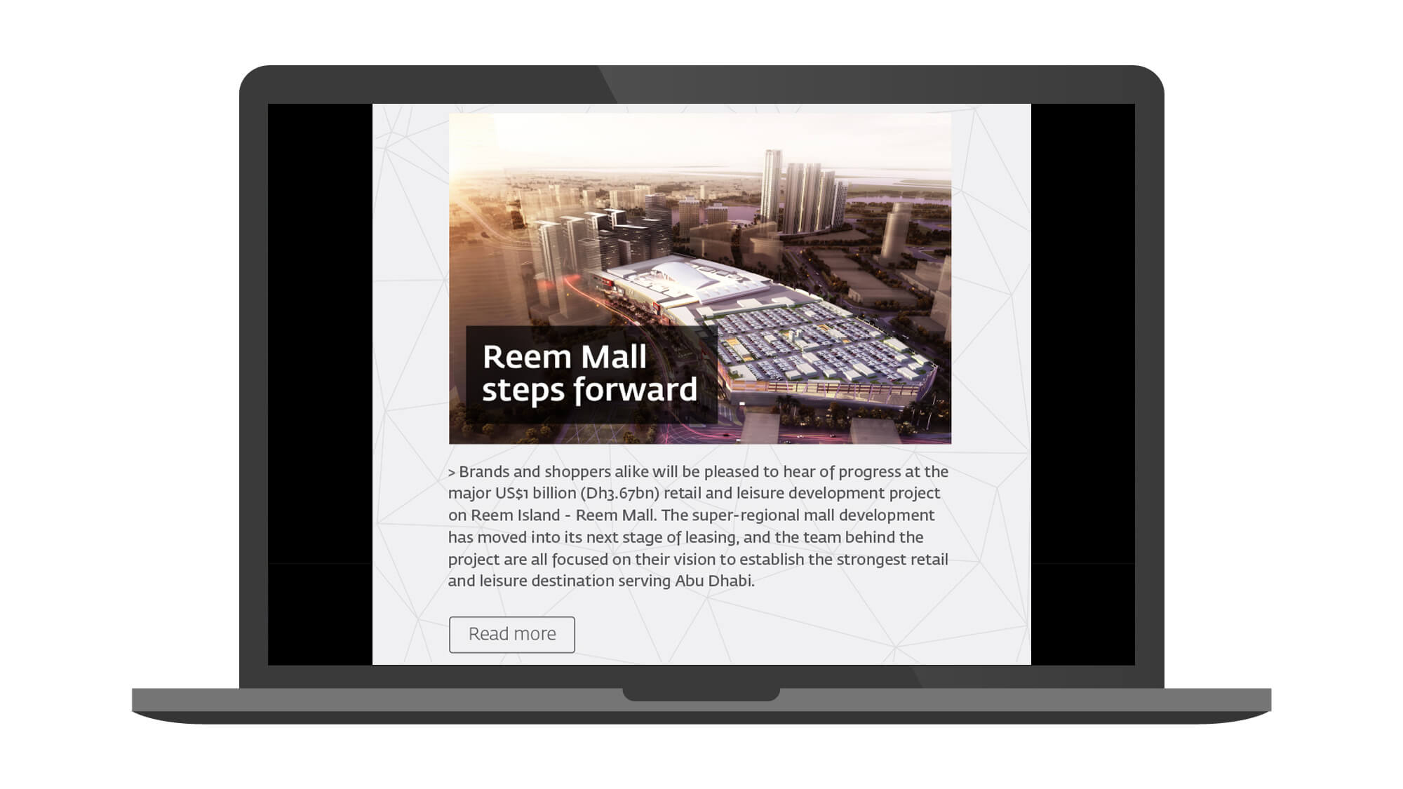
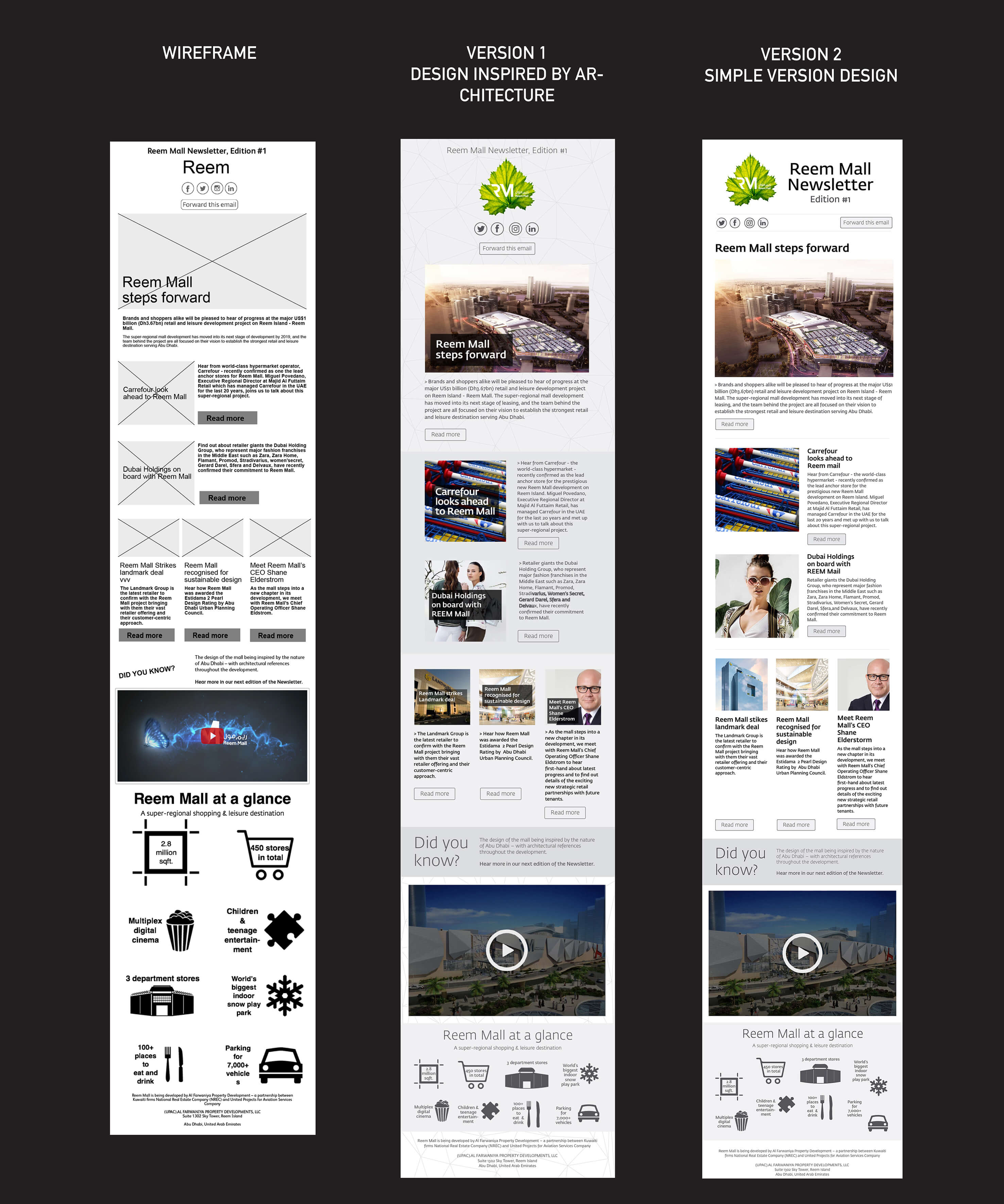
- The email starts out with a dynamic photograph of the architecture which grabs readers' attention. Below this, you'll find a typeoragraphical layout design with articles sized in accordance with importance and hierachy.
- The design of the email is clean and sophisticated, thanks to a brilliant use of negative space and attractive fonts.
- There is consistent use of colouring, especially the signature grey hues throughout the designs.
- Short text blocks that link back to full articles or product pages on your website or to landing pages. That way the email displayed just enough information to get the audience interested in reading more about it.
- Since people use different email browsers on desktop and smartphone use has skyrocketed an email needs to be mobile friendly and displays optimally between a desktop/laptop and ensuring that it will look great regardless of where your subscribers read it. It’s very unlikey thay the user will be able to open a background image or the background may stretch and lose its quality, which will ruin the design of the newsletter itself, therefore I kept the background design white with no image.
- The emails were tested thoroughly on all devices and clients.
Wireframe and Brand Guidelines

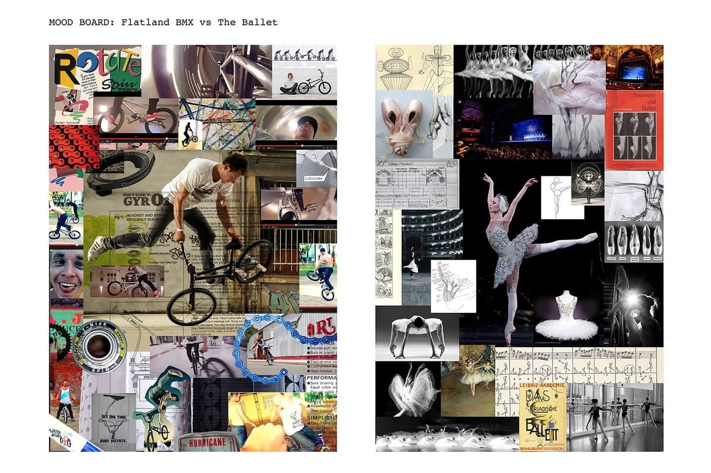
Visual References

Reem Email Design Versions


The Steps
Below you will see how the design took shape from wireframing to experimenting with design and then then to the final mobile friendly solutution.

Results
The design rendered beautifully across all email clients and on mobile devices. The email has been successful at informing users of news and developments at Reem Mall and has increased customer loyalty and awareness.


