
Creating a new visual identity for a local community centre and cafe in Didsbury, Manchester, UK

The Challenge
Didsbury Good Neighbours is a local charity based in Didsbury park in Manchester whose aim is to support senior members of the Didsbury community through a volunteer befriending service and a programme of weekly activities. Situated in Didsbury Park, they have a beautiful community centre where activities and classes are held. There is also and a busy cafe called The Pavilion that serves food and drinks including barista coffee and homemade cakes to the community centre attendees and the local community.
My task was to assist their marketing advisor to create a logo and accompanying stationery, information leaflets, posters, T-Shirts and other promo materials that would help Didsbury Good Neighbours build a timeless and distinctive visual identity that will be instantly recognisable in the local area and will reflect the friendly and helpful services that they provide. I was also asked to design a visual identity for the The Pavilion Cafe. This design needed to show that this is an independant cafe with excellent quality and value homemade food and ethically sourced teas and coffee can compete for custom against the very best cafe chains and local independent cafes that Didsbury has to offer. Since the Pavilion is ran by Didsbury Good Neighbours, The Pavilion logo needed a similar look and feel to show that it is part of the same charity while also having it own unique identity.
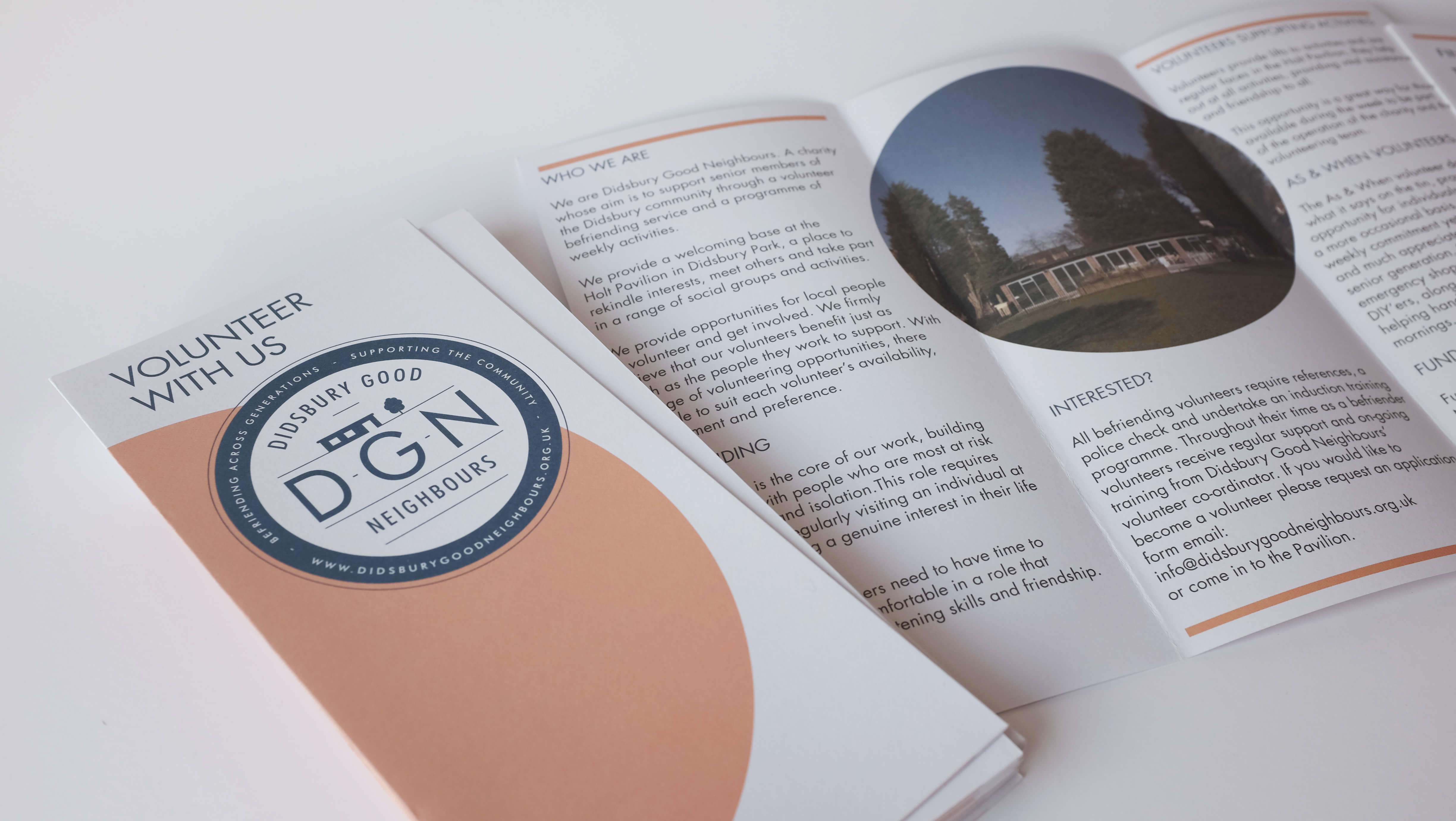
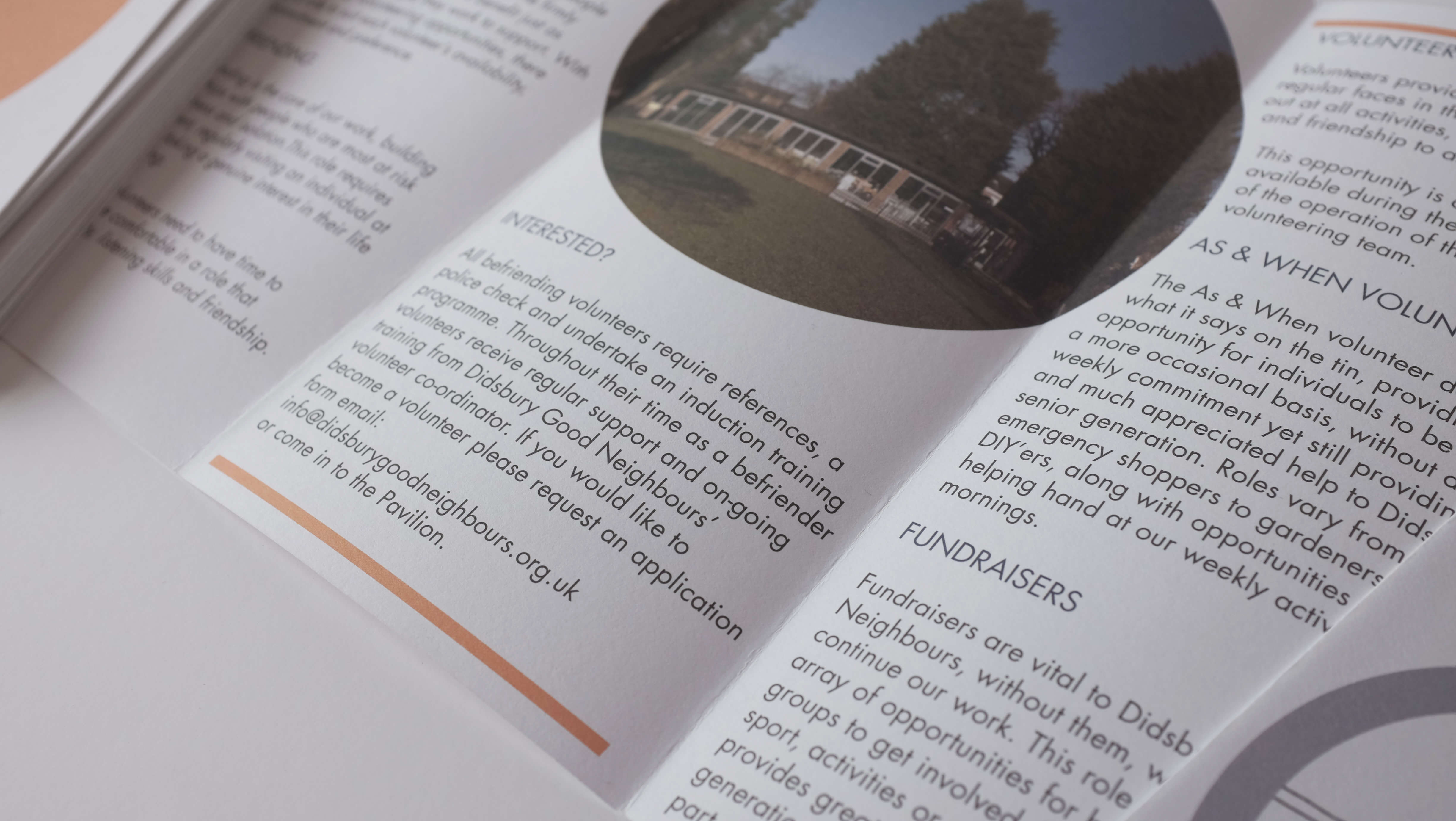
The identity design for DGN needed to look professional and trustworthy while not seeming stuffy or pompous — the charity wants the senior members of the community to feel comfortable enough to use the community centre and join in with the activities. They also want volunteers to get involved, join in and enjoy their experience. It was important to the charity that the information leaflets contain large print so that they can read them even if their eye sight is weakening.
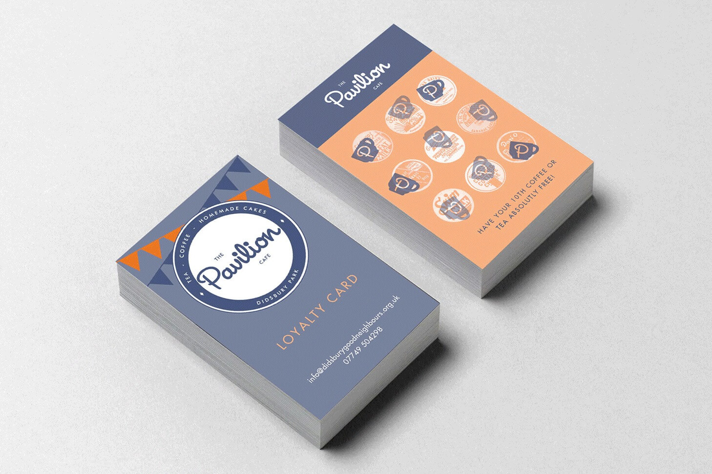
The logo for The Pavilion needed to look like a fun, trendy, independent cafe while appealing to all ages as well as the older generation who use the adjoining community centre — the cafe wants to be a place where everyone from the community can come together.
I was also required to create guidelines for the new visual identity, laid out in a PDF document along with a number of poster and flyer templates so that with the support of the guidelines and templates, the charity can create and print weekly posters and flyers themselves in their community centre office rather than pay an expert designer. Since charities need to take extra care with their budget, I understand that this is a very useful and economic way of saving their much needed resources.
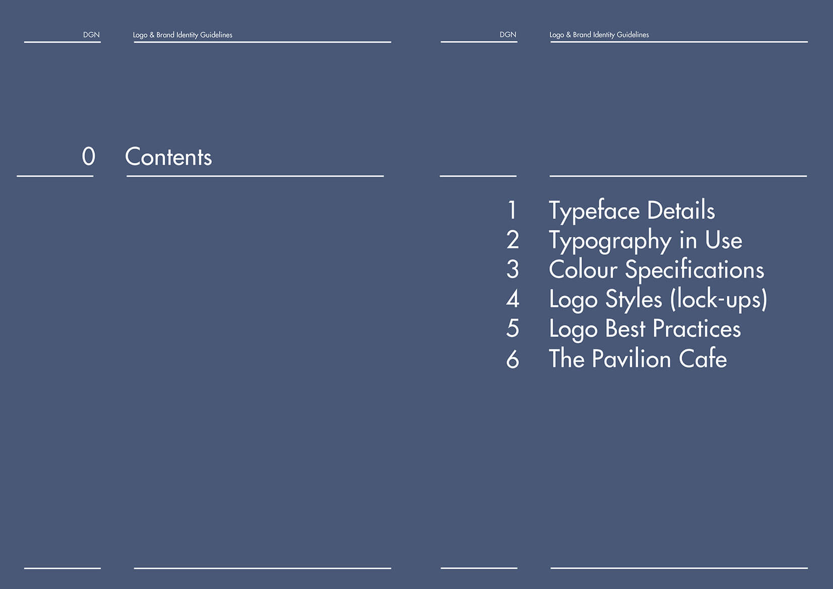
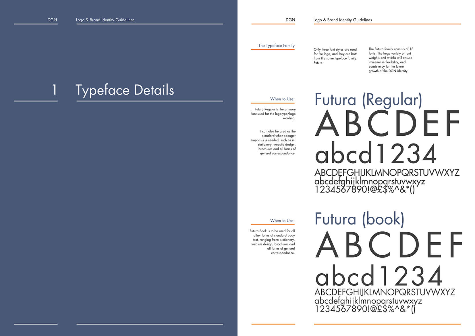
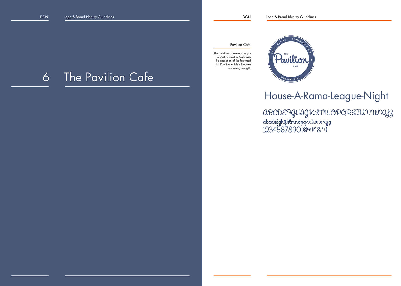
DGN and Pavilion Cafe Visual Identity Guidelines



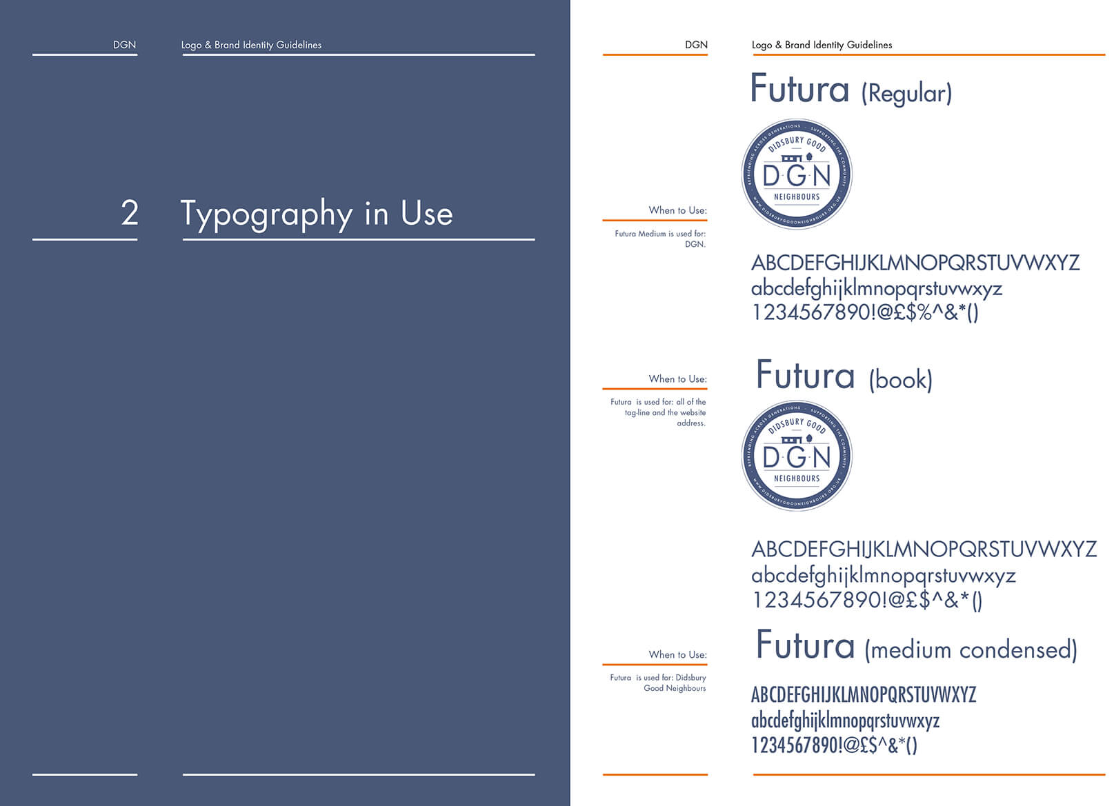

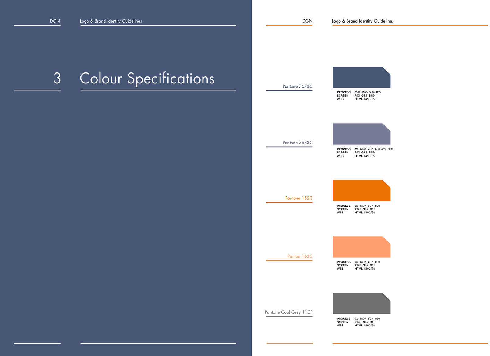

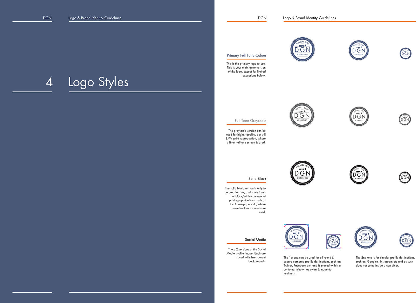

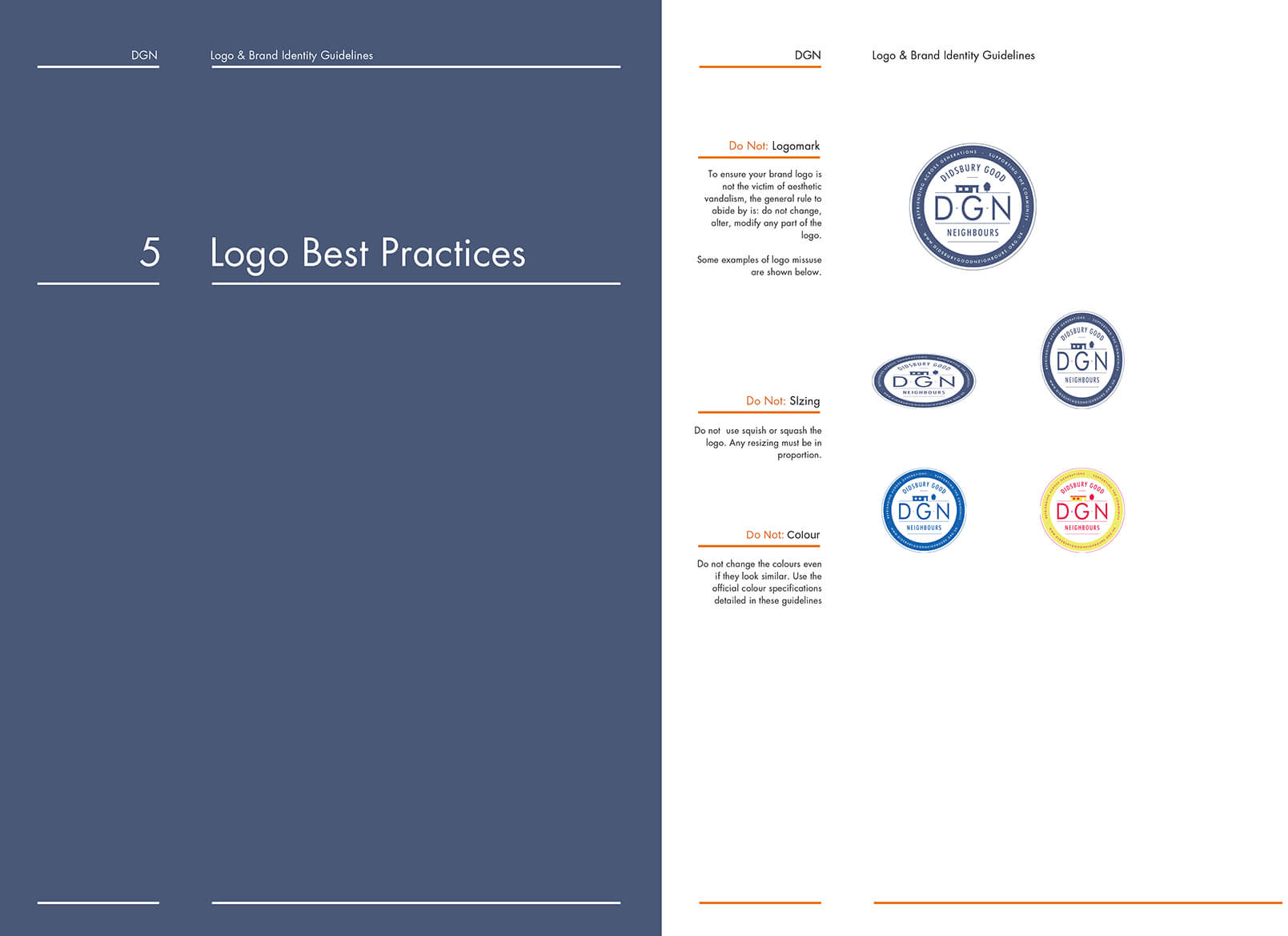


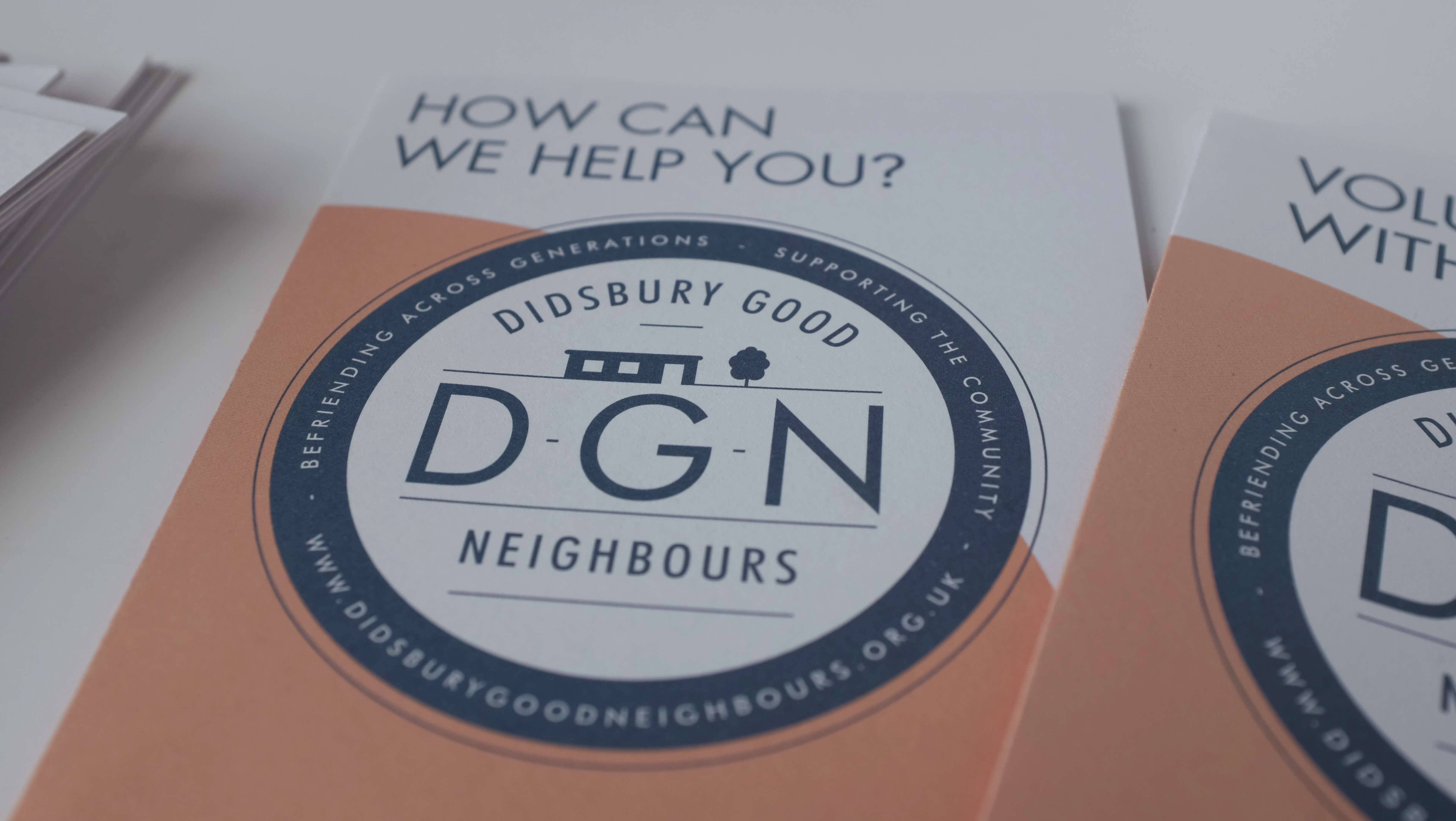
Large Print Information Leaflets



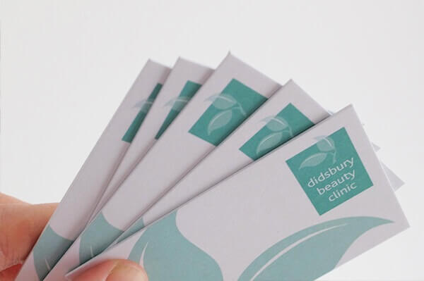
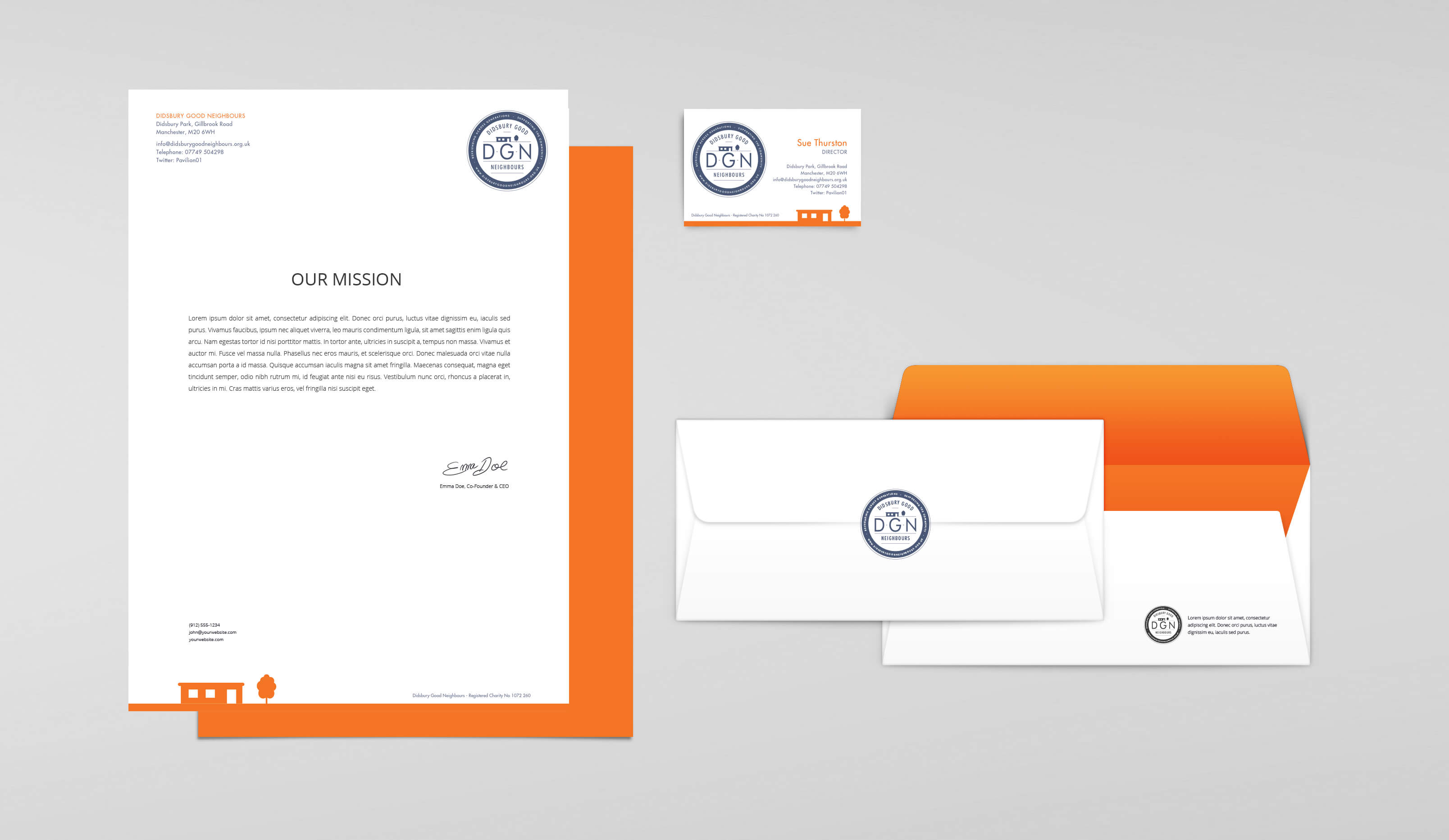
DGN Stationery

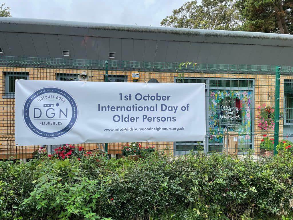
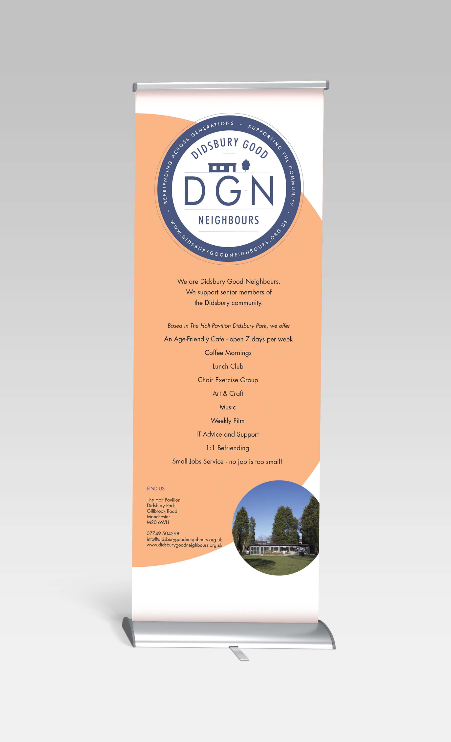
Exhibition Banner & Promo Night Poster



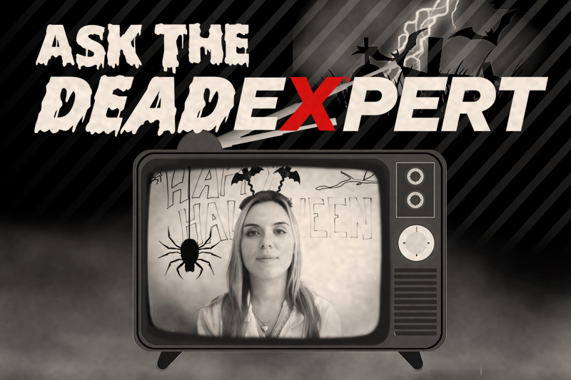
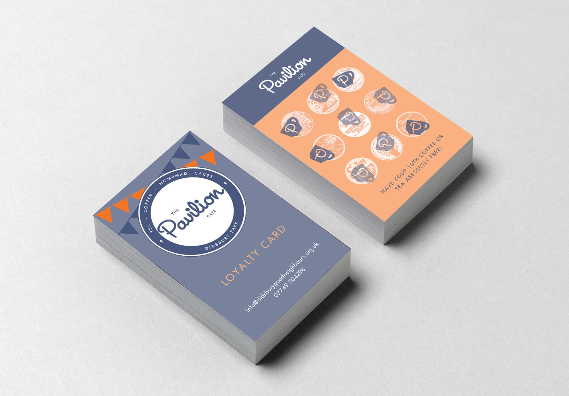
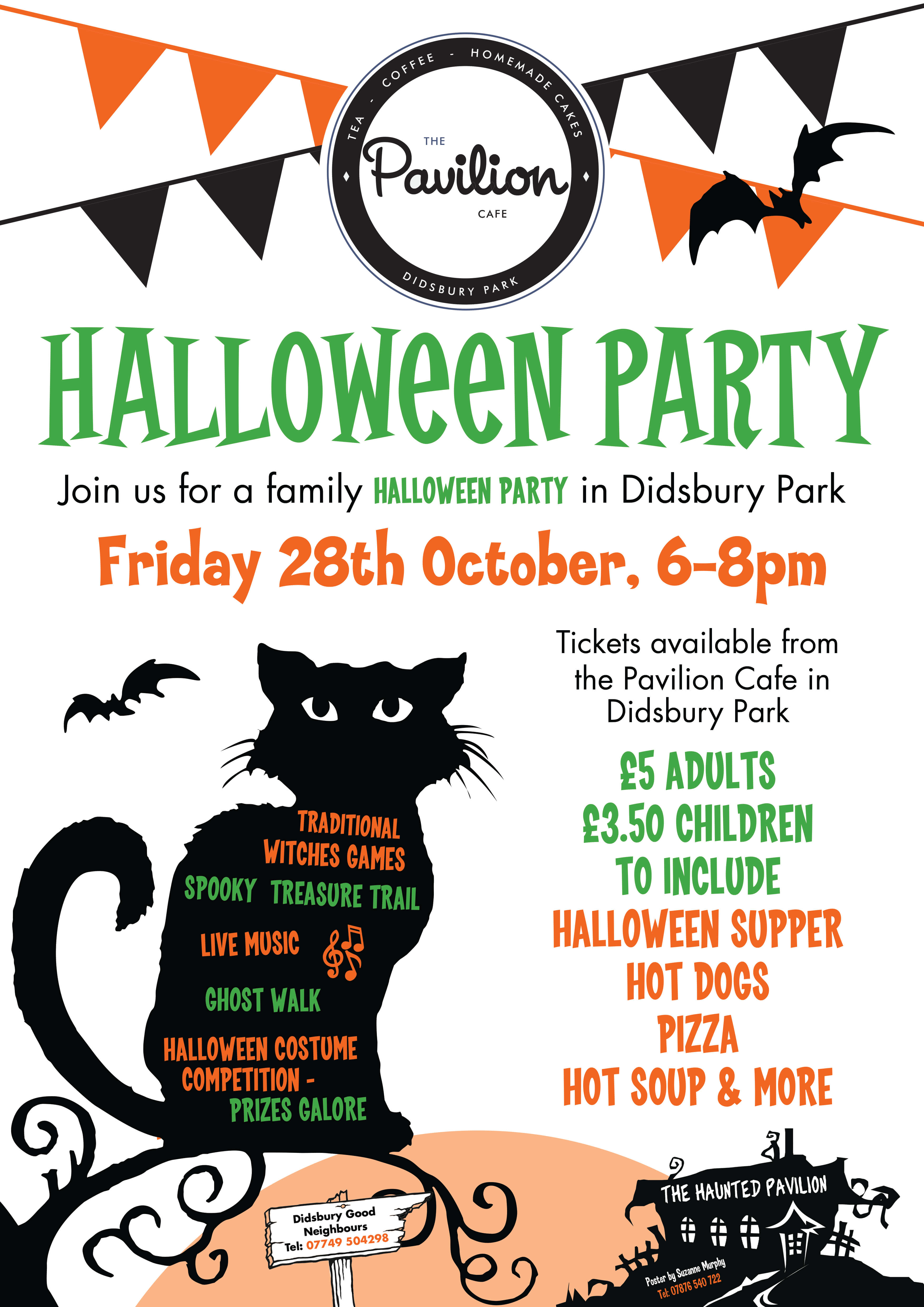
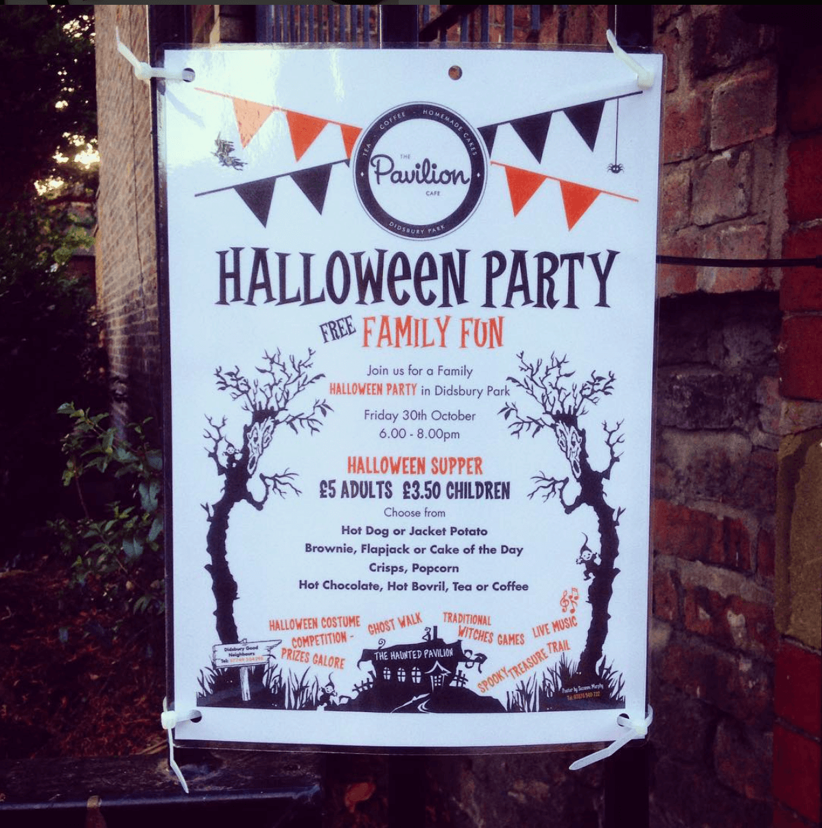
The Pavalion Cafe - Promotional Materials




The Solution
Both logos have friendly looking circular blue band designs that have a 1940’s/50’s feel about them. The font in the DGN logo is Futura which was used often during this time period and the The Pavilion font is a fun swirly script font similar to signs and advertising posters that were hand drawn during this period.
“The effectiveness as a mark was apparent on launch day, in watching how visitors reacted to both logos,” said Sue Thurston, Director of DGN. “They are accessible, and people understand them instinctively.”
Deliverables included the logos, stationery, notice board posters, information leaflets, exhibition banner, promotional ink stamp, t-shirts, a graphic standards guide and a range of Microsoft Word poster and flyer templates.
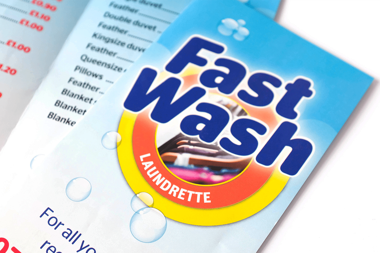
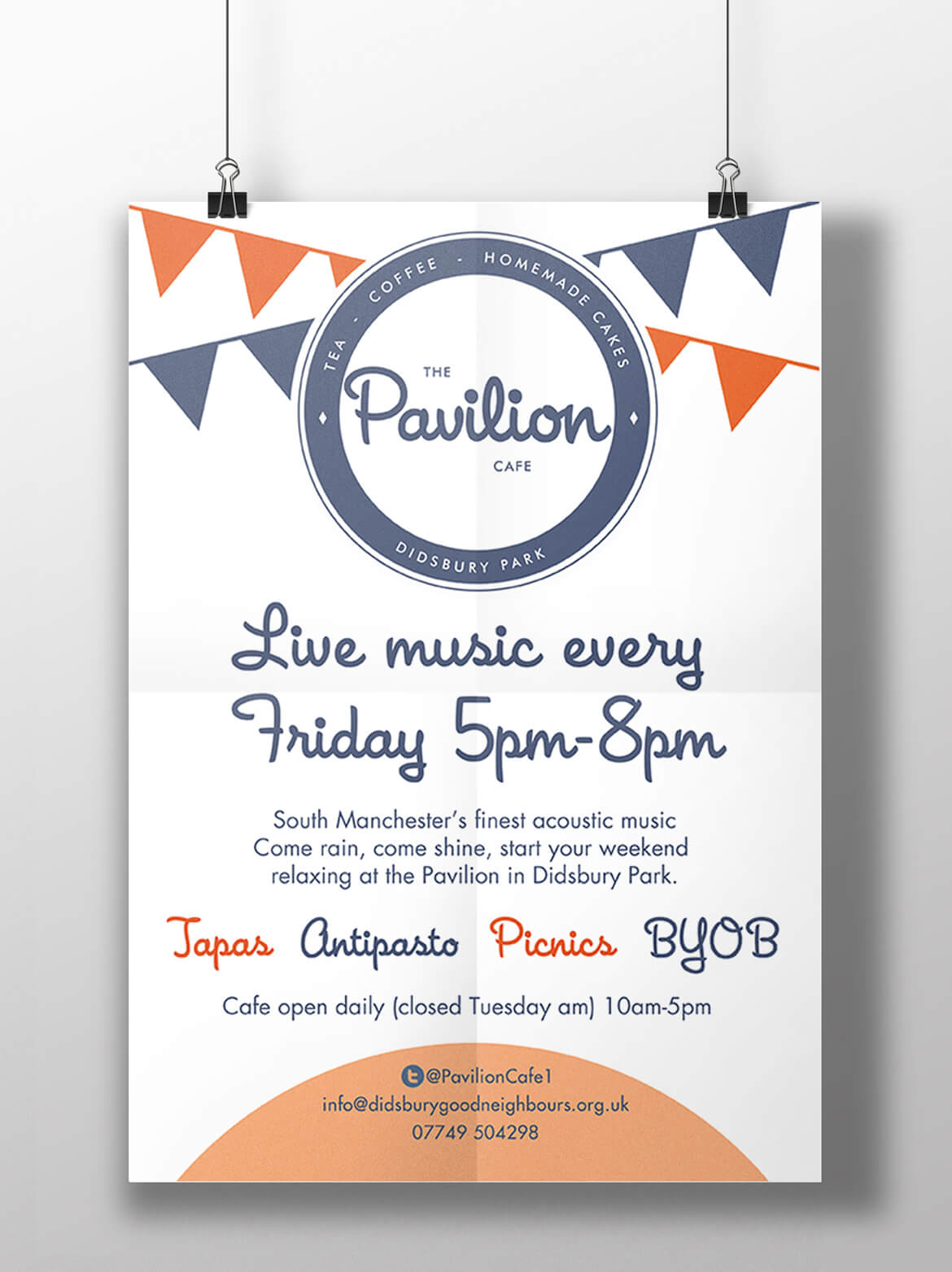
The layout of the leaflets contain large print so that they are clear enough for a senior citizen who may have weakening eye sight to read. Fun was had designing the lively posters for The Pavilion’s ‘Live Music Night’ and ‘Halloween Night’ that are open to everyone in the Didsbury community.
The leaflets were printed on 170gsm recycled bond paper which is a sturdy paper weight for a leaflet so they are built to last and cost effective. DGN wanted to print on recycled paper because it feels that caring for the environment goes hand in hand with caring for the community. Also the way that the colours look subtle on this uncoated stock give the identity a very independant company feel rather than a polished finish often used by corporate companies.
As a printing reseller I went to great lengths to barter with as many trusted printers as possible to ensure that the charity gets the best deal around.
All of files that the charity needed to sufficiently print their own marketing materials such as Microsoft poster and flyer template files and high quality logo files were transfered to the charity on completion of the project. I also gave the charity administrator some training on how to successfully use the templates. I continue to give them support.
Feedback
We have built a relationship with Suzanne over the past two years, asking her for advice on a range of design and communications issues as we have progressed with building a corporate image for our charity and social enterprise - Suzanne has been very patient with us and no questions have been unanswered!
As a small charity we have to watch the money very carefully, sourcing best value print and marketing materials is of prime importance to us and we have valued Suzanne’s knowledge and suggestions of ways to keep control of costs.
We hope to continue to work together as both our organisations prosper and grow.
- Sue Thurston (Director), Didsbury Good Neighbours
I met and worked with Suzanne whilst interning for a charity based in Didsbury. Suzanne played vital part of creating a new logo and set of promotional materials, taking design ideas and turning them into reality! She was great to work with and the charity and I were so so pleased with the final result.
- Katie Beesley (Marketing Intern), Didsbury Good Neighbours
The Process/Art-board
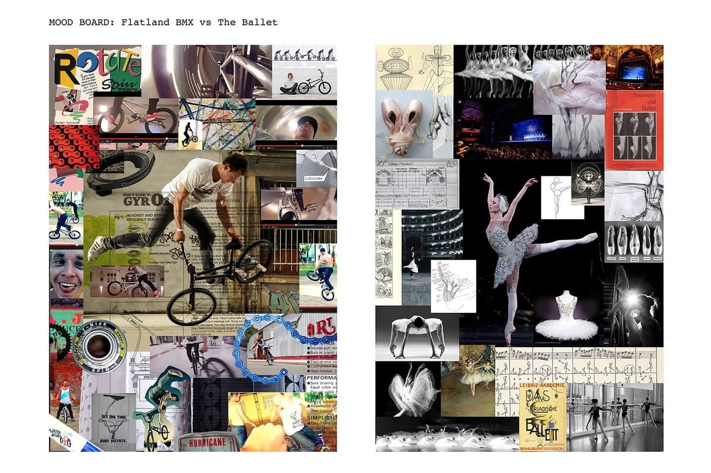
Sketches and ideas by Katie Beesley who I collaberated with on this project (mentioned above). All computer generated work and other ideas by me.
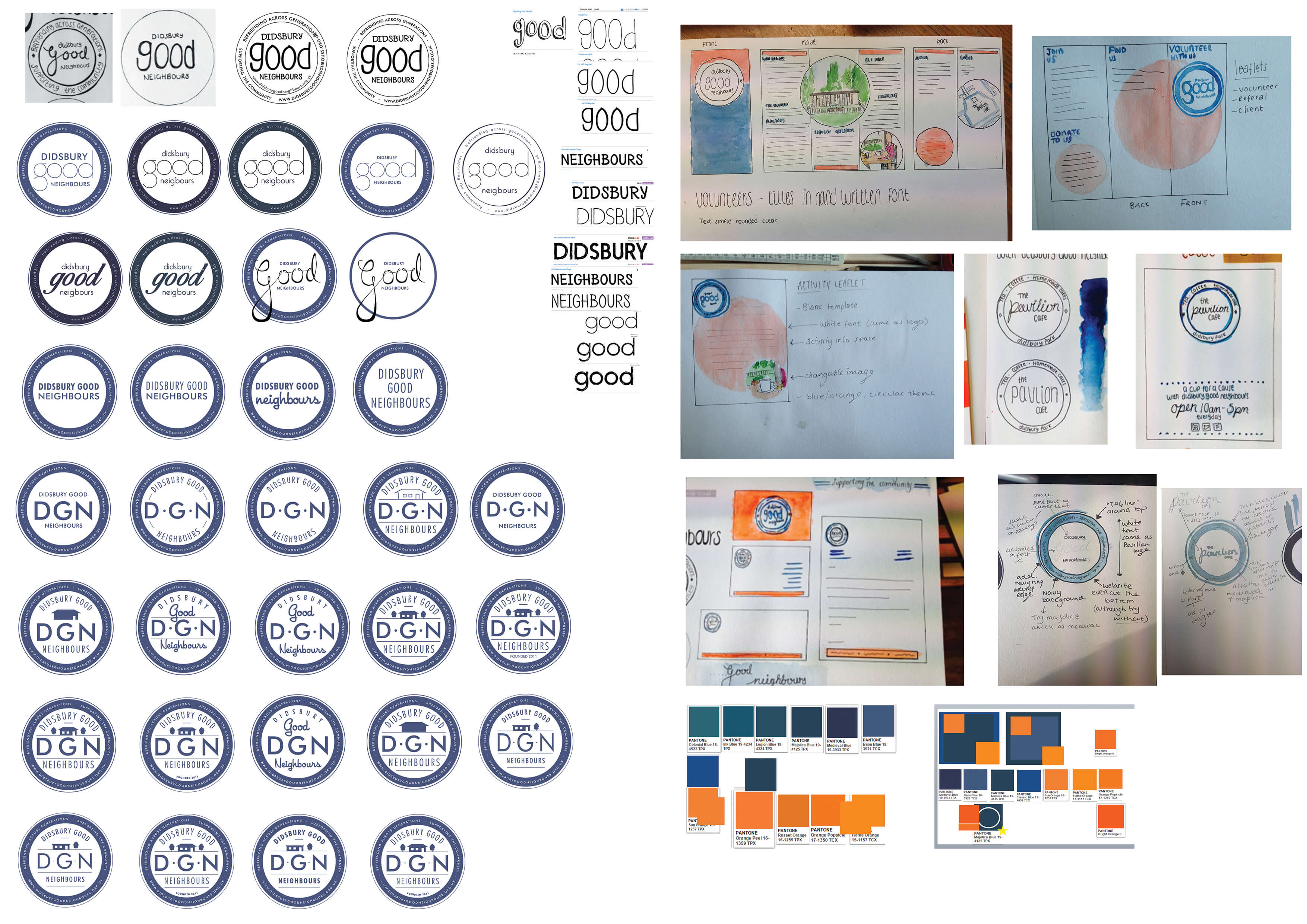

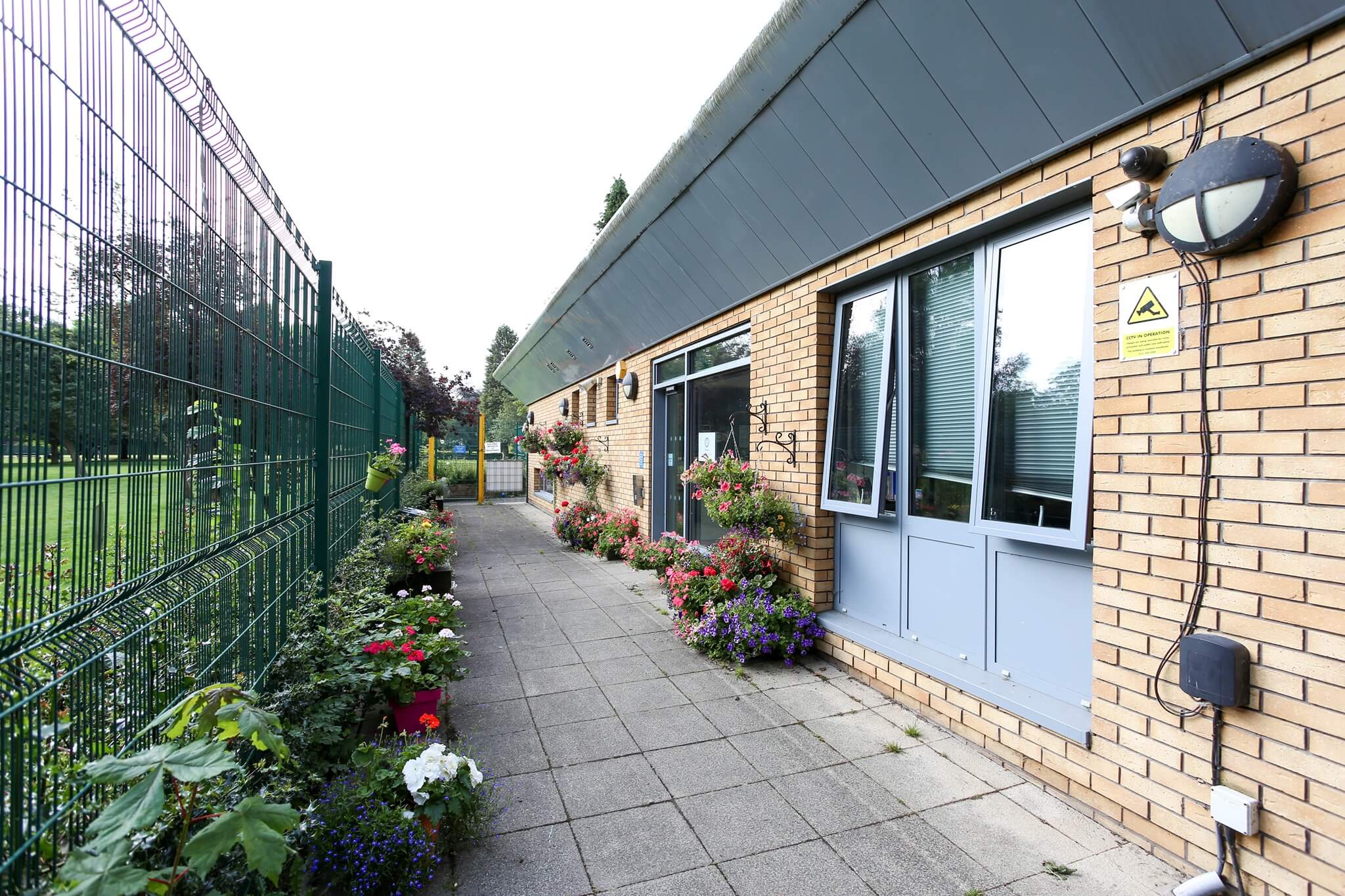
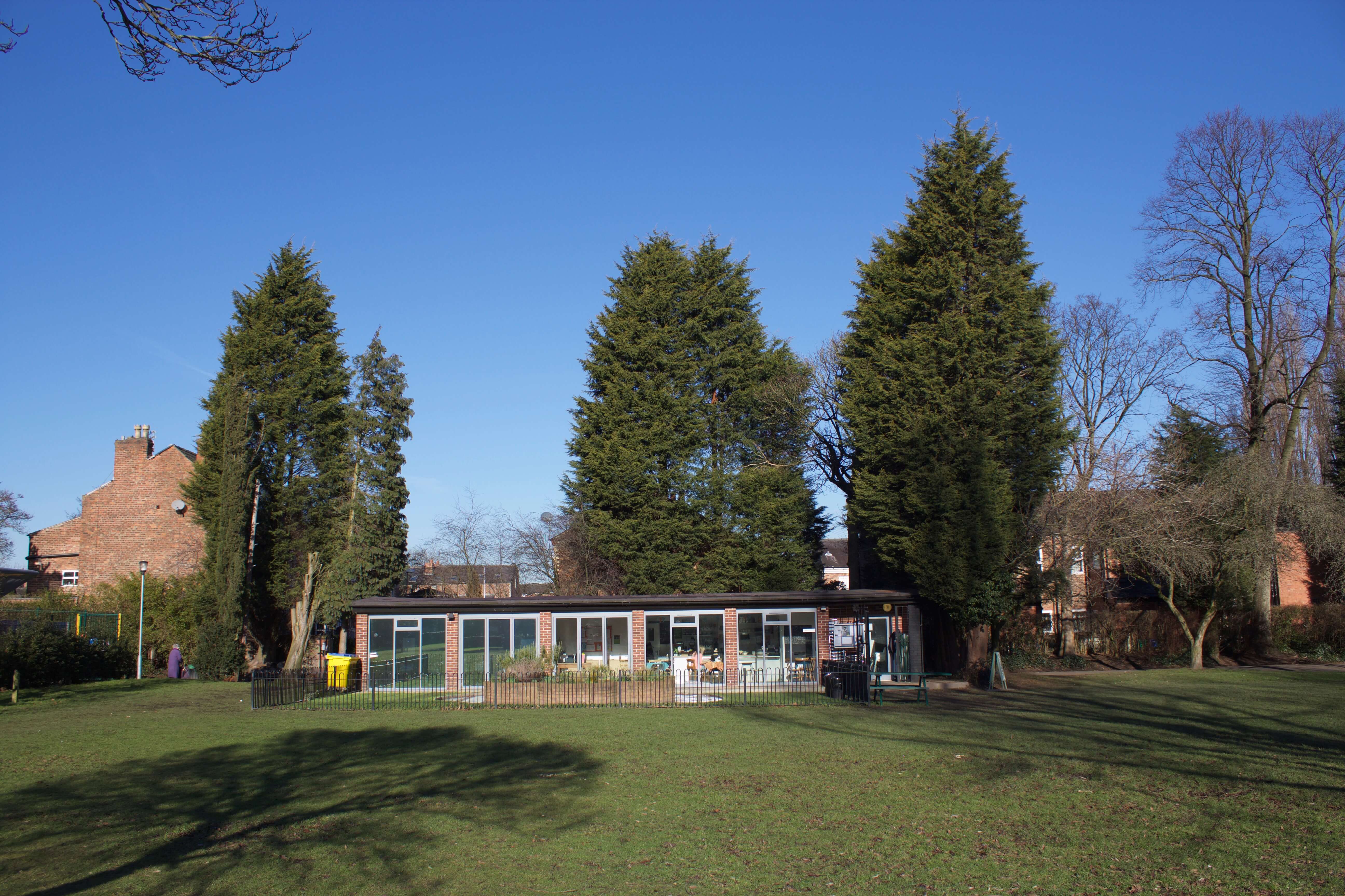
Photo - The Didbsury Community Centre and Pavilion Cafe, Didsbury Park, Manchester, UK.
