A distinctive visual identity for the UK's Medical Practitioners Tribunal Service
The Challenge
Medical Practitioners Tribunal Service (MPTS) is a tribunal service for doctors in the UK. They run hearings, which make independent decisions about whether doctors are fit to practise medicine.
Their vision is to provide a modern medical practitioners tribunal service that is effective fair and impartial. It is a service that makes high quality, well-reasoned, independent decisions to protect the public. Runs hearings efficiently and effectively, using resources appropriately. Treats all tribunal service users with respect and fairness. Has a distinct voice, clearly articulating their role.
The MPTS had a logo that contained small text that is hard to read. It had no flexibility and didn't work digitally. They also had a colour pallette that was limited and flat. Overall their visual identity was not distinctive enough.
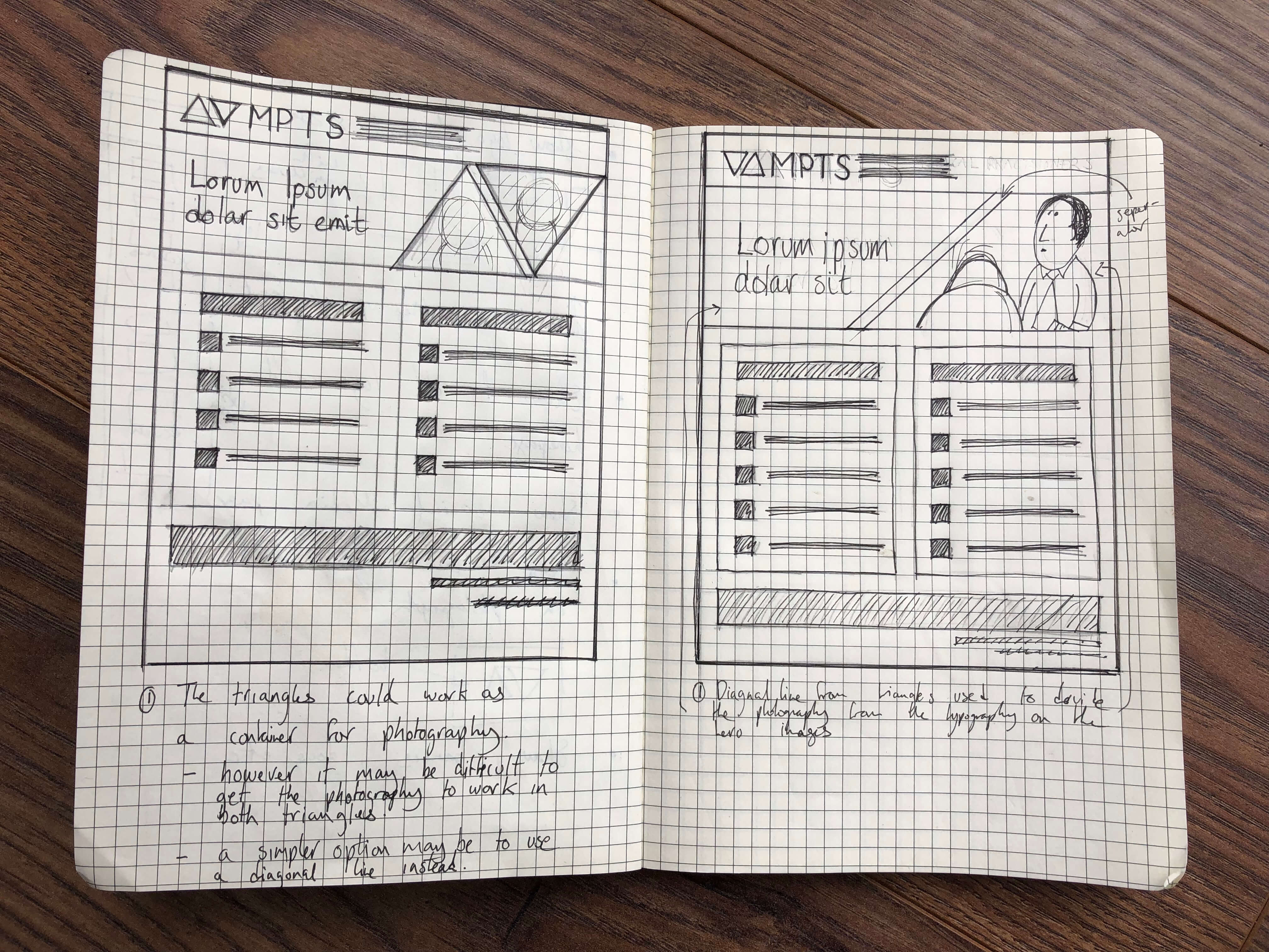
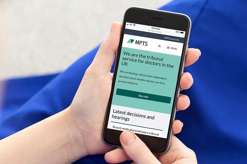
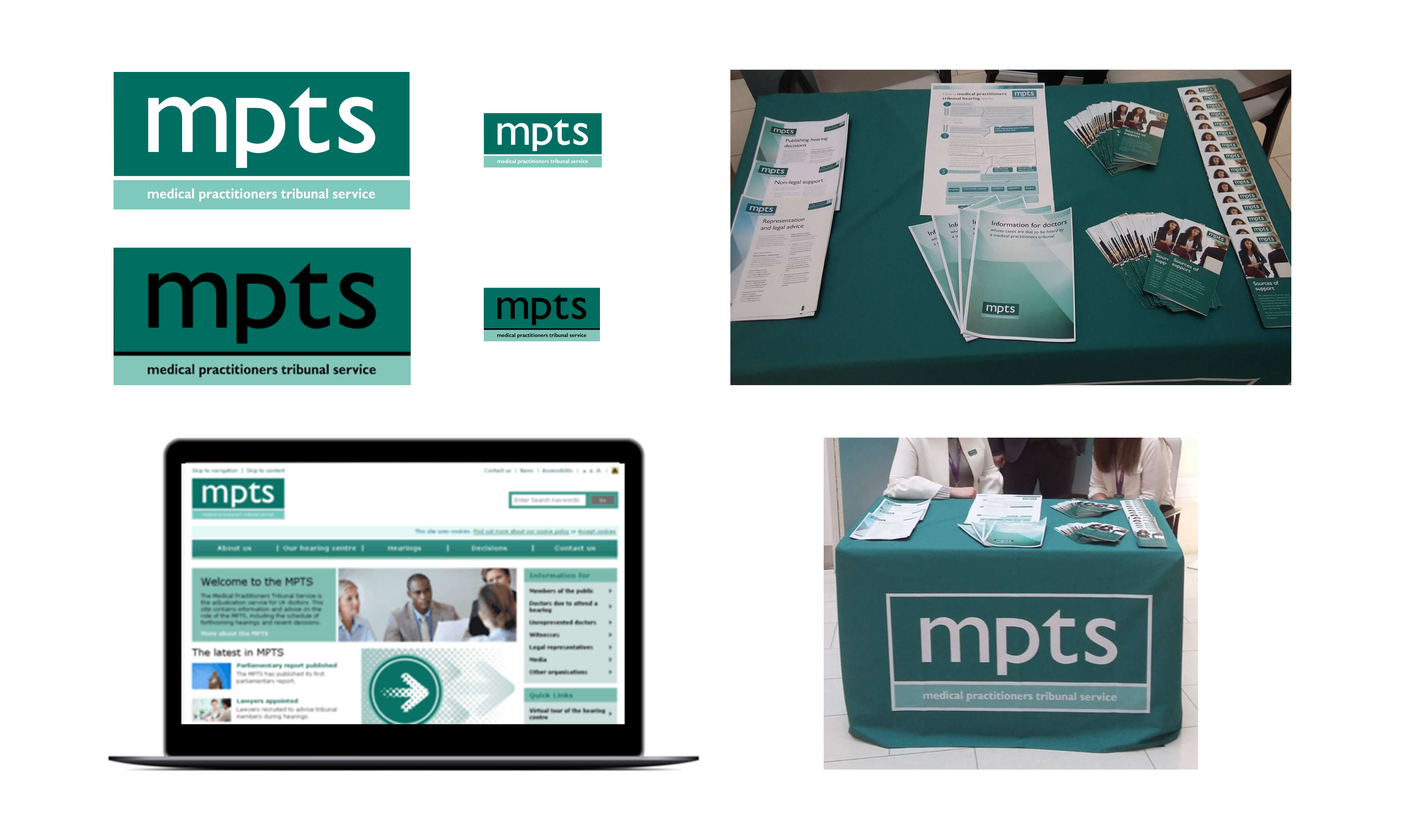
While I was contracting at the The General Medical Council as part of the Digital Transitions team it was up to me to design a new visual identity for the MPTS along with a set of identity guildlines, front end pages for the MPTS's responsive website and show how the logo design would work on signage, exhibition banners, hearing documents and powerpoint templates.
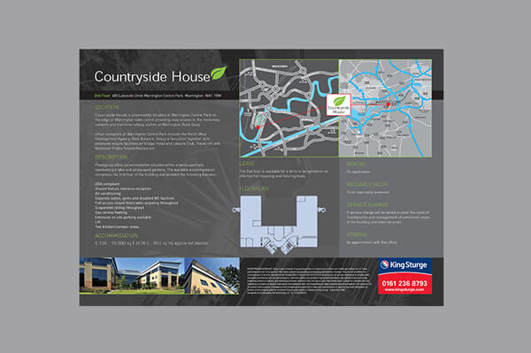
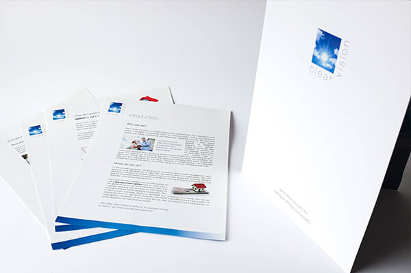
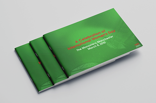
The MPTS graphic design before the change

The Solution
Working closely with the digital transitions team at The General Medical Council, we identified 4 main needs:
• Project the image of a modern, forward-looking organisation, appropriate to values and audience requirements.
• Strengthen and promote key messages of trust, solidity, neutrality.
• Show support for doctors and witnesses.
• Be distinctive - create a true sense of separation from the General Medical Council.
Designing a logo for the MPTS


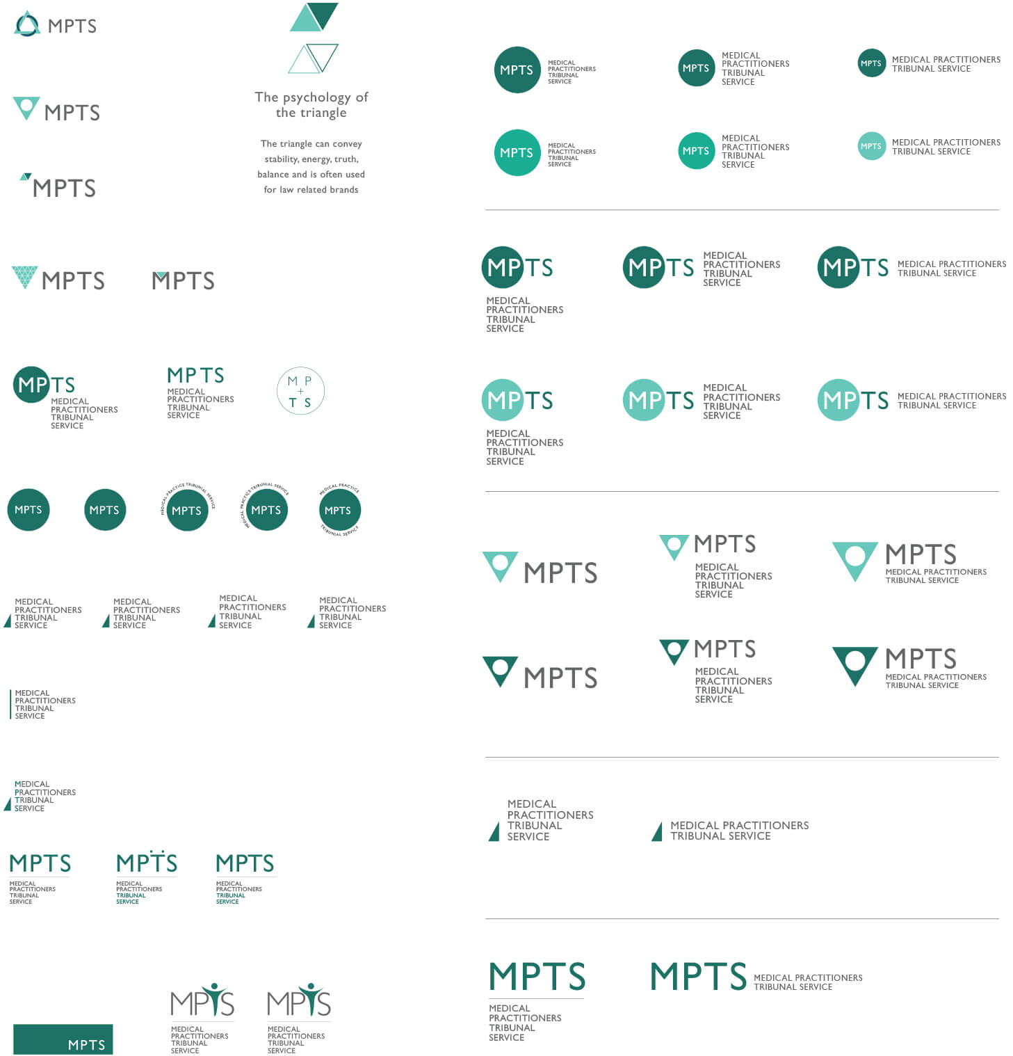
The final MPTS logo explained
The final logo for the MPTS, as presented throughout this page, includes a carefully designed symbol that includes the following features:
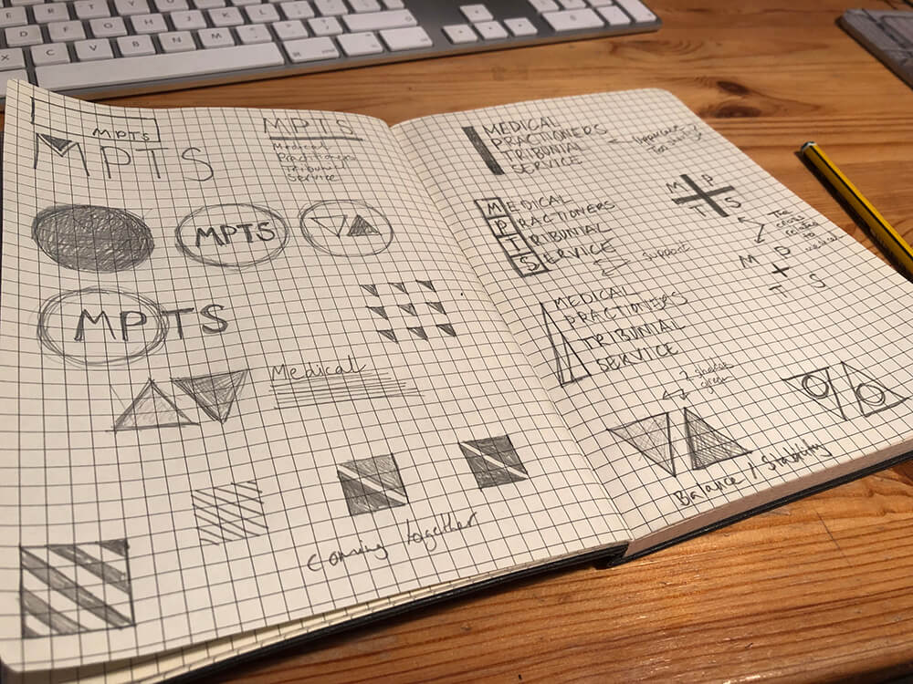
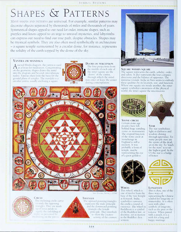
• When designing the symbol I took inspiration from the psycology and history of shapes. From my research I discovered that the triangle when balanced is the symbol for justice, strength, trust and stability therefore I felt that it is was appropriate to the field of law and medicine.
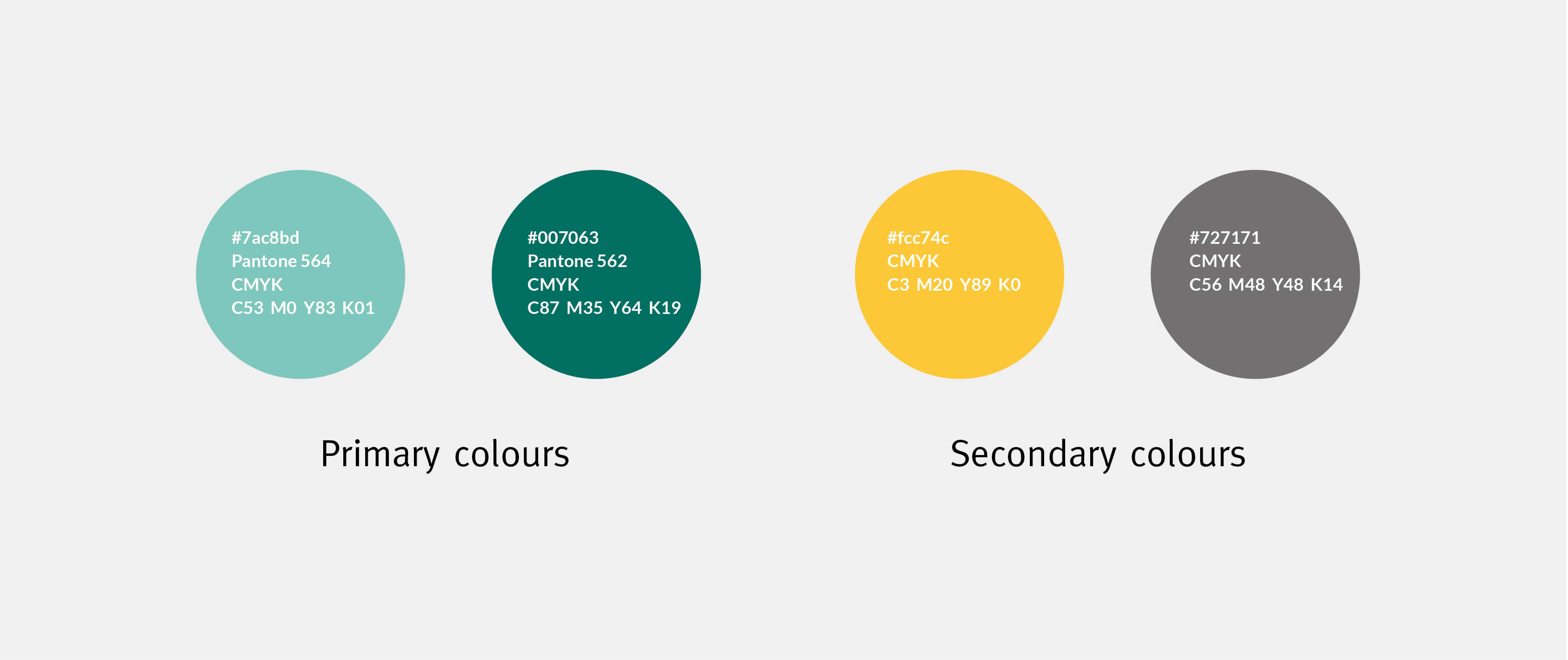
• My team and I decided to select the two green colours because our research found that doctors associate the MPTS with the colour green because this is the main colour used in their existing visual identity. From my colour psycology research I discovered that to the human mind green is a calming colour and so I felt that doctors, witnesses and MPTS lawers would benefit from the calming effect of these two complimentary greens.
• The construction of the symbol is simple, modern, balanced and has a bold graphic aestetic. I balanced the two triangles together in opposite directions to symbolise the coming together of doctors and witnesses who may or may not have different views and opinions.
• To support the symbol a modern San Serif typeface called Lato was selected that can be downloaded for free to anyone from Google. We felt that this is the right font for the MPTS because of its practicallity, simplicity and accessibility. Lato is also user friendly because it was designed especially for digital, which means that it is easy to to read on all digital devices such as tablets, phones, laptops etc.





Creating a photography and colour tone moodboard
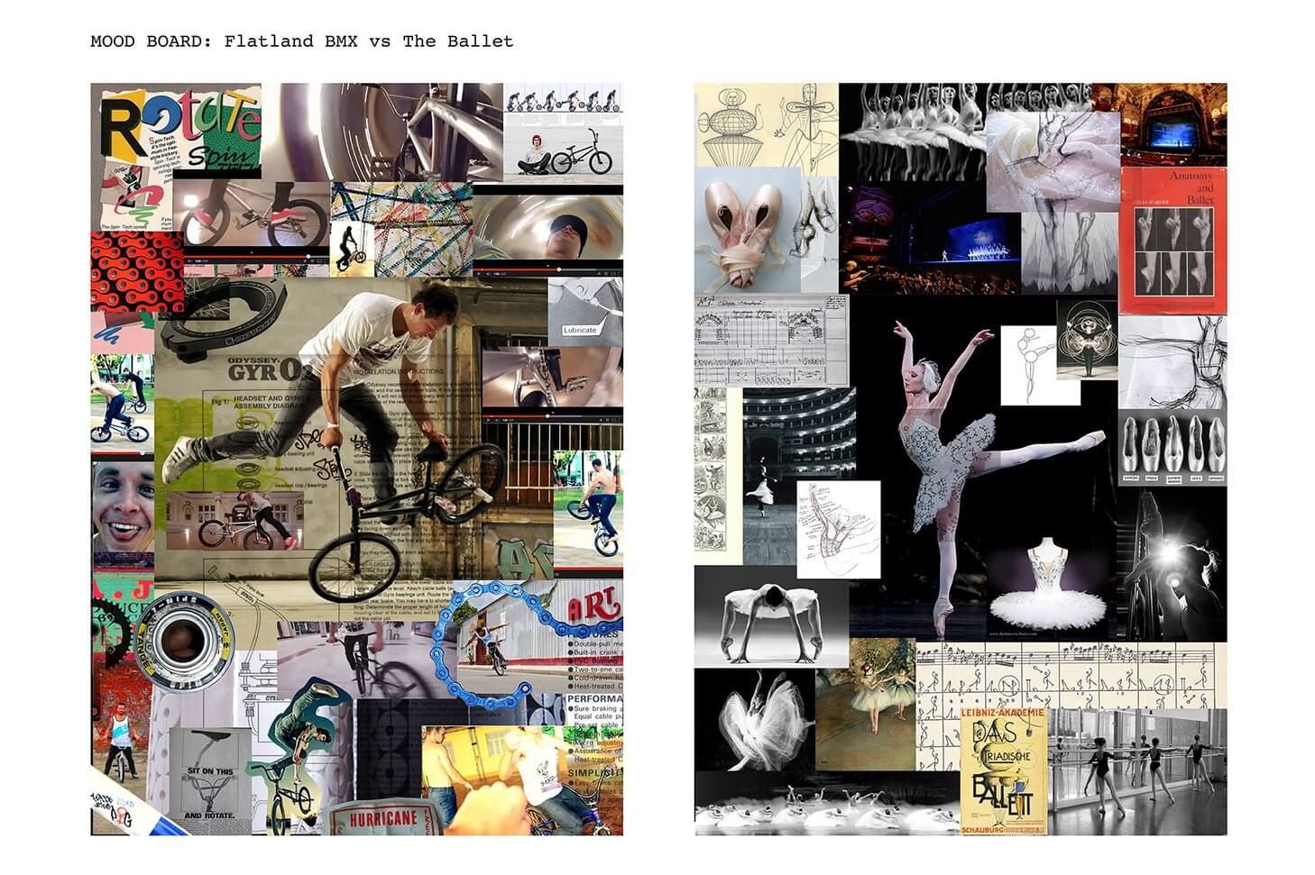
I created this mood board using stock photos and a complimentary colour pallette as a visual collage of inspiration designed to provide the in-house marketing team with a visual reference guide that everyone can agree on before the MPTS commisioned photo shoot. We felt that doctors and witnesses would benefit from seeing what actually goes on before, during and after an MPTS trial and that this will help to humanise the MPTS.


Refreshing the colours, making them more accessible and testing

Testing
The logo was subject to rigorous testing by focus group. This provided valuable input since trademark design requires considerations other than immediate, subjective reactions.
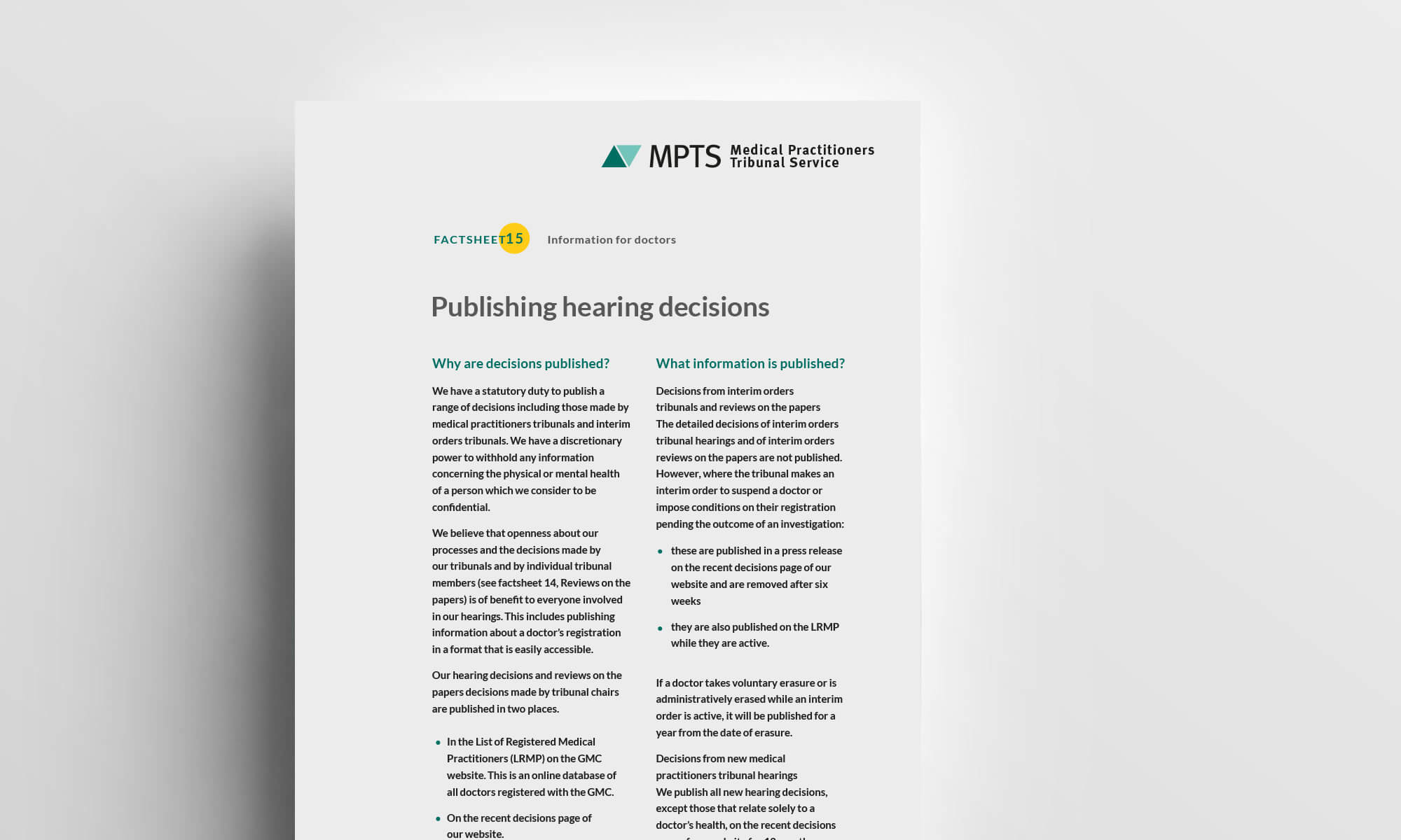
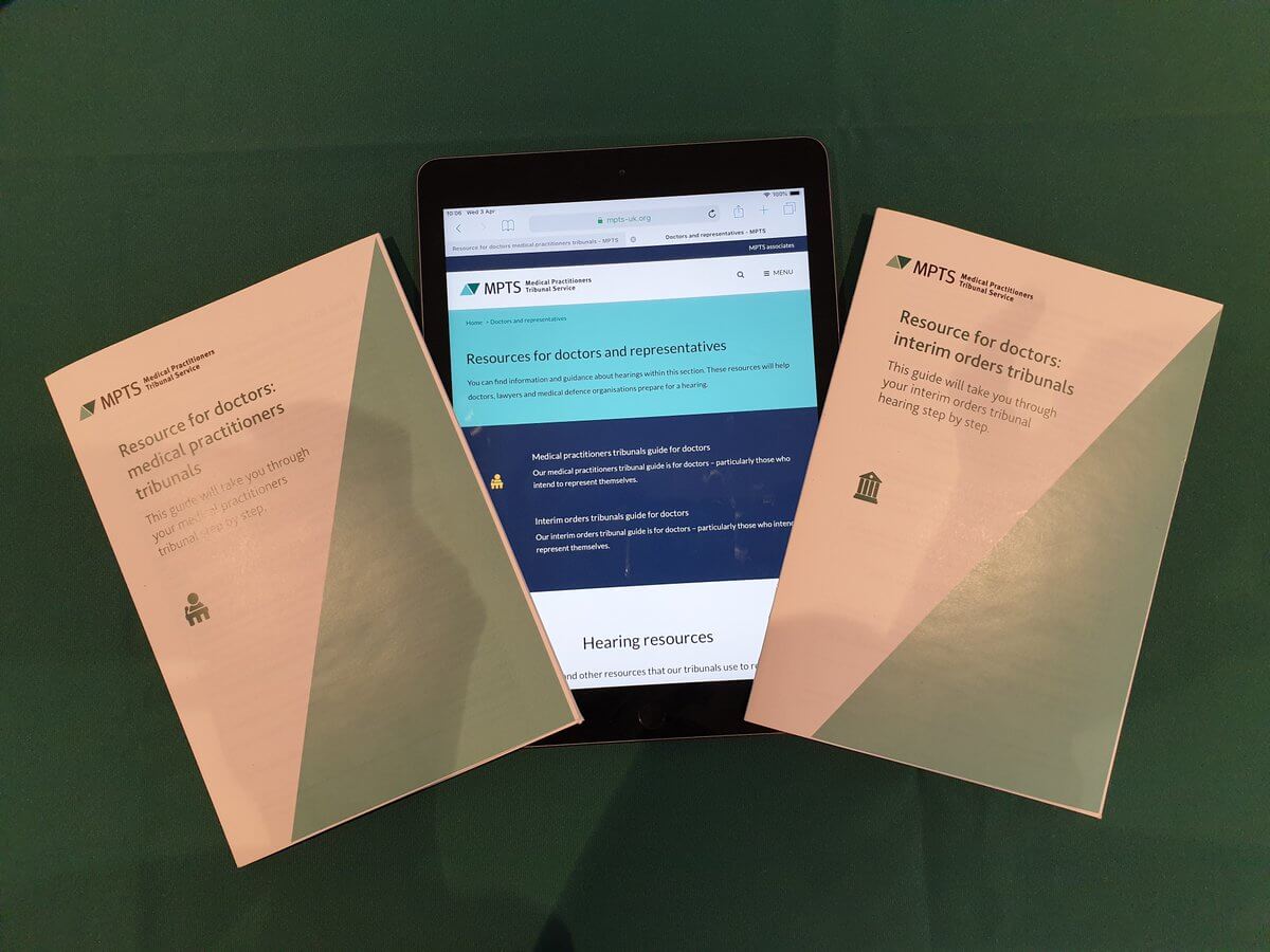
Applying the new identity to important documents and other print materials



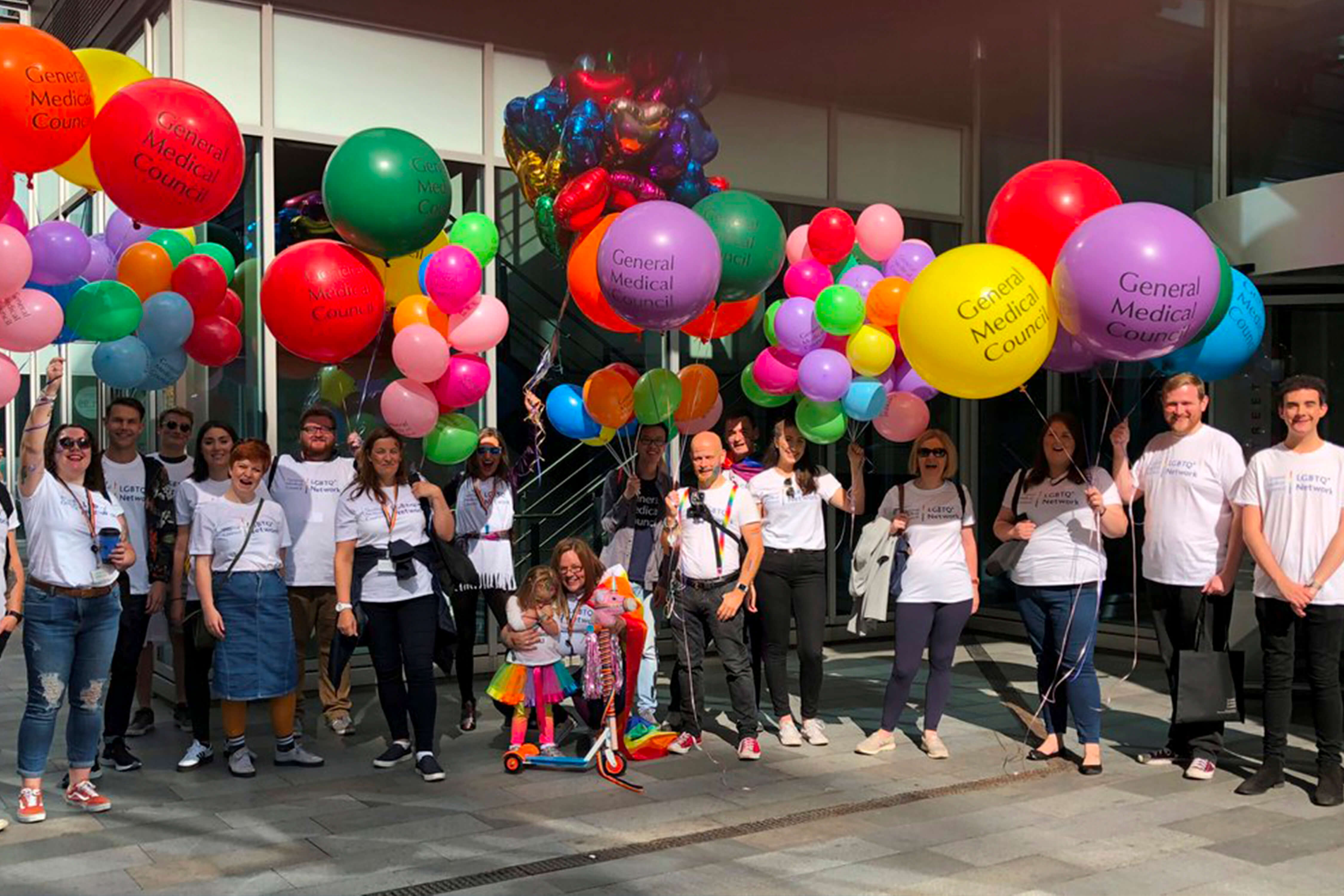
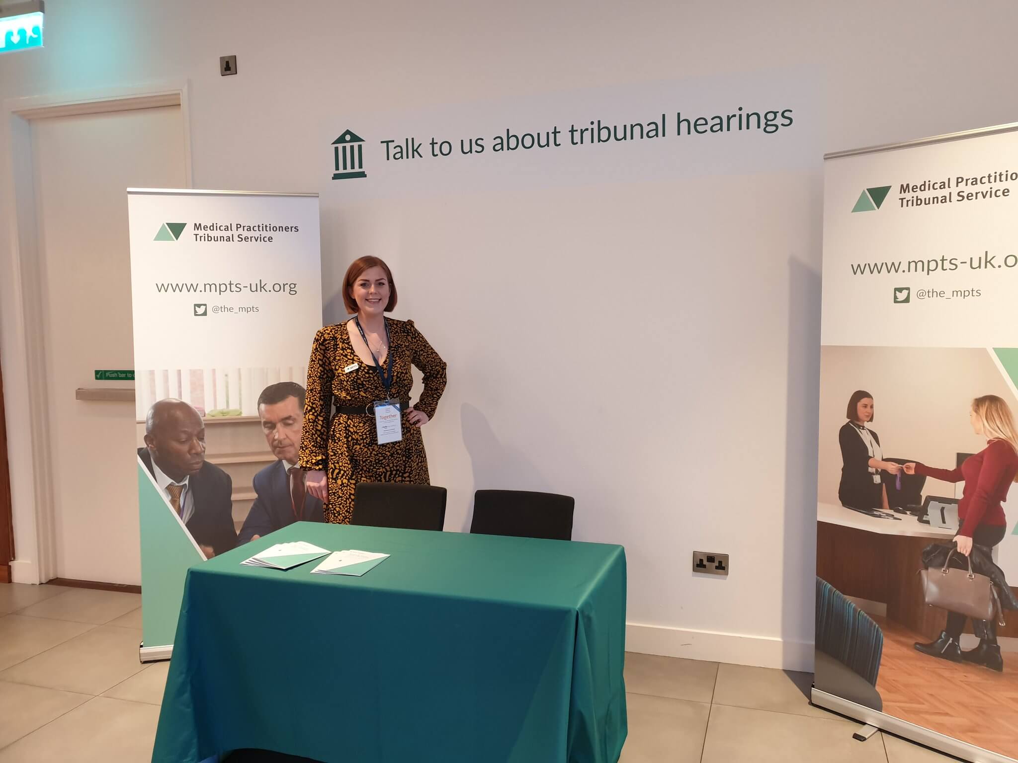
Snapshots taken at an event revealing the new 'look and feel' for the MPTS


How the new logo was elegantly animated


The design process
The approach practiced in this case can produce trademarks that endure ending level of public awareness-indeed that can become iconic. To learn more about the design process of the MPTS identity you are welcome to check out my blog report here http://www.suzannemurphy.co.uk/articles/
Feedback
We're very happy with it - glad you convinced us about the triangles.
- Medical Practitioners Tribunal Service
A taster of my research, initial ideas, concepts and sketch work
